Case Media
Case Notes
This page keeps the media, full prompt, and original source together so you can inspect the result first and decide whether the prompt is worth copying, saving, or comparing.
Case Insights
To make this page easier to search, cite, and reuse later, the case is also broken down into practical guidance about usage, visual cues, and prompt structure.
Best Fit Scenarios
- Use this as a character design benchmark when you need a fast style baseline before rewriting your own prompt.
- It is especially helpful if your target overlaps with Fashion, Poster, Illustration and you want to judge the image result before tuning wording.
- Keep it as a control sample when you compare nearby prompt variants one variable at a time.
Visual Signals To Notice
- The clearest style signals here are Fashion, Poster, Illustration, so those should usually stay in your first rewrite.
- Look at silhouette, costume language, mood styling, and whether the character reads clearly at a glance.
- This case keeps 2 media outputs, which makes it easier to check whether the style remains stable across multiple results.
How The Prompt Is Structured
- The prompt reads as a long, highly specified prompt, which is useful when you want to judge how much specificity this direction needs.
- Its keyword cluster is centered on Fashion, Poster, Illustration, so you can usually keep that cluster while swapping subject, camera, layout, or copy details.
- A practical rewrite path is: keep the outcome, keep the strongest style cues, then replace only the subject and environment blocks.
Good Follow-up Questions
- What changes first if you keep Fashion, Poster, Illustration but switch the subject matter?
- Which part of the result comes from section-level structure (Character Design) versus tag-level style cues?
- Which related cases in the same section give you a cleaner or more extreme variation of the same direction?
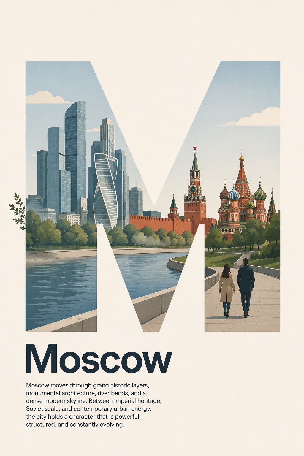
Full Prompt
Design a contemporary Swiss Style editorial poster for Moscow, Russia. Use a large bold sans-serif capital letter “M” as the main typographic structure. The “M” must be very clear, clean, geometric, solid, and dominant, with no stroke outline, no border, no shadow outline, and no decorative treatment. The silhouette of the letter “M” must remain easy to read at first glance. Do not let the illustration obscure or distort the shape of the letter. The poster should follow a precise left-aligned Swiss grid system with generous negative space. Inside the “M”, create a simple, logical, and restrained flat illustration of Moscow’s city landscape character. Use only a few essential visual elements: simplified modern skyscrapers inspired by Moscow City business district, the calm curve of the Moscow River, a subtle silhouette of the Kremlin walls and towers, onion domes of Saint Basil’s Cathedral in a simplified geometric form, a soft green park landscape inspired by Gorky Park or Zaryadye Park, and two pedestrians on a clean riverside walkway. Keep the composition minimal, spacious, and easy to understand. Do not add too many landmarks, people, signs, vehicles, monuments, statues, fountains, trains, buses, or small decorative objects. The illustration should suggest Moscow’s identity as a capital city where imperial history, Soviet monumental scale, modern glass skyscrapers, riverfront public spaces, and vast urban rhythm coexist in a clean contemporary way. Use flat vector shapes, clean silhouettes, minimal linework, simplified architecture, and believable scale relationships. Keep the scene lightly lively but not busy. The illustration should support the letter “M”, not compete with it. Allow only extremely subtle overlap outside the “M” frame using simple organic or atmospheric elements only: a few leaves from riverside trees or soft atmospheric mist over the river may slightly extend beyond the letter edge. Keep 97% of the illustration inside the “M”. Do not let people, buildings, domes, towers, vehicles, faces, paths, signage, or complex objects overlap outside the letter. The “M” must remain clearly readable and visually dominant. Place the headline “Moscow” below the letter in bold sans-serif type, title case, not all caps, left aligned to the same grid. Under the headline, add this short body paragraph in small regular sans-serif text, also left aligned, with clean spacing and refined editorial hierarchy: “Moscow moves through grand historic layers, monumental architecture, river bends, and a dense modern skyline. Between imperial heritage, Soviet scale, and contemporary urban energy, the city holds a character that is powerful, structured, and constantly evolving.” No icons, no badges, no decorative symbols. The overall design should feel Swiss minimalist: strong grid, precise alignment, asymmetrical balance, clean typography, generous negative space, restrained composition, and modern cultural city poster aesthetics. Color palette: warm ivory background, deep navy or charcoal typography, concrete gray, glass blue, pine green, Kremlin red accents, river blue-gray, pale beige, and soft black accents. Matte paper finish, subtle paper grain, crisp edges, flat contemporary illustration, modern Moscow metropolitan mood, calm but strong, sophisticated, balanced, and print-ready. Negative prompt: photorealistic, 3D render, glossy, maximalist, overcrowded city, complex illustration, too many details, too many landmarks