Case Media
Case Notes
This page keeps the media, full prompt, and original source together so you can inspect the result first and decide whether the prompt is worth copying, saving, or comparing.
Case Insights
To make this page easier to search, cite, and reuse later, the case is also broken down into practical guidance about usage, visual cues, and prompt structure.
Best Fit Scenarios
- Use this as a character design benchmark when you need a fast style baseline before rewriting your own prompt.
- It is especially helpful if your target overlaps with Fashion, Poster, Illustration and you want to judge the image result before tuning wording.
- Keep it as a control sample when you compare nearby prompt variants one variable at a time.
Visual Signals To Notice
- The clearest style signals here are Fashion, Poster, Illustration, so those should usually stay in your first rewrite.
- Look at silhouette, costume language, mood styling, and whether the character reads clearly at a glance.
- This case keeps one primary output, so the first image should be treated as the main visual reference.
How The Prompt Is Structured
- The prompt reads as a long, highly specified prompt, which is useful when you want to judge how much specificity this direction needs.
- Its keyword cluster is centered on Fashion, Poster, Illustration, so you can usually keep that cluster while swapping subject, camera, layout, or copy details.
- A practical rewrite path is: keep the outcome, keep the strongest style cues, then replace only the subject and environment blocks.
Good Follow-up Questions
- What changes first if you keep Fashion, Poster, Illustration but switch the subject matter?
- Which part of the result comes from section-level structure (Character Design) versus tag-level style cues?
- Which related cases in the same section give you a cleaner or more extreme variation of the same direction?
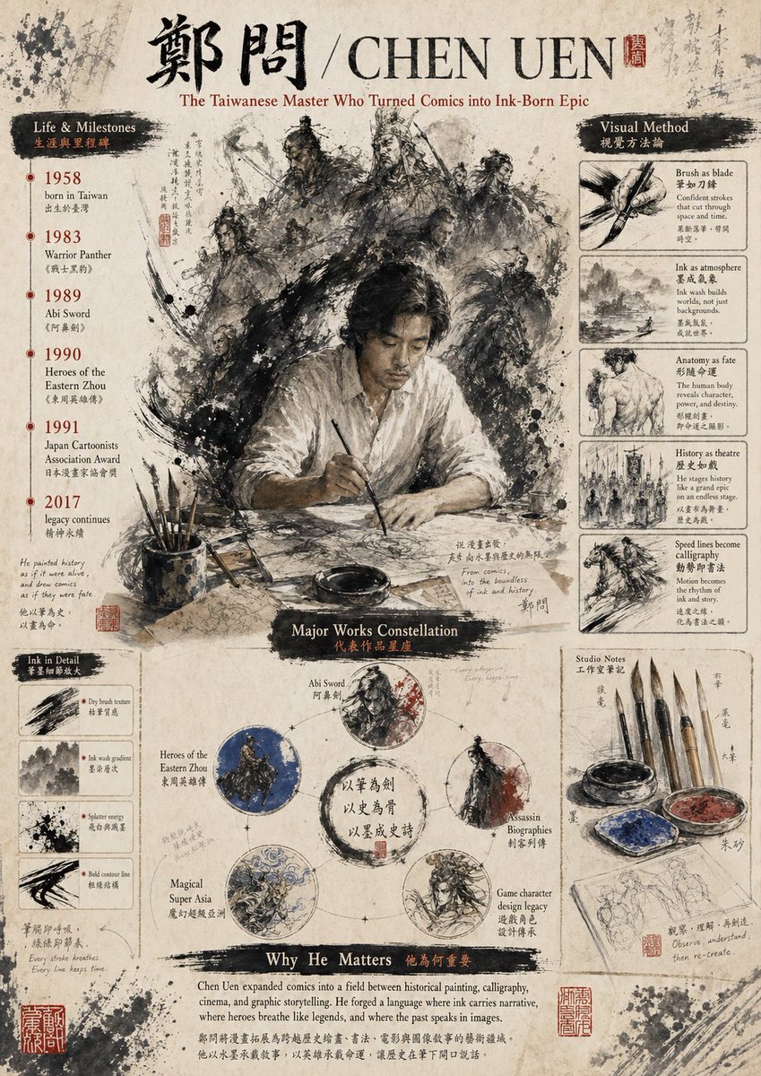
Full Prompt
Create a vintage editorial poster on aged rice paper celebrating {argument name="artist name" default="CHEN UEN"}, designed like a museum infographic mixed with Chinese ink wash illustration and calligraphy. The format is a single vertically oriented poster with a weathered parchment background, ink splatters, faded handwritten annotations, red seal stamps, and a scholarly, archival atmosphere. At the very top, place large black Chinese calligraphy for the name 鄭問, followed by a slash and the romanized name {argument name="romanized name" default="CHEN UEN"} in large serif capitals, with a small red seal beside it. Under the title, add the subtitle {argument name="subtitle text" default="The Taiwanese Master Who Turned Comics into Ink-Born Epic"} in elegant reddish-brown serif text. In the center, feature a dramatic painterly scene of 1 seated male artist in a loose white shirt at a desk, holding a brush over paper, his face intentionally obscured by a soft rectangular blur. Behind him, surround him with a swirling halo-like storm of monochrome ink-brush warriors and historical figures: exact count 9 visible character figures, including armored generals, swordsmen, and mounted riders, emerging from explosive black brushwork and smoke-like ink textures. On the left side, create a vertical section titled “Life & Milestones” with a black brushstroke header and smaller Chinese subtitle text. List exactly 6 timeline entries with red year markers and bilingual captions: 1958 born in Taiwan, 1983 Warrior Panther, 1989 Abi Sword, 1990 Heroes of the Eastern Zhou, 1991 Japan Cartoonists Association Award, 2017 legacy continues. Below that, add a small section titled “Ink in Detail” containing exactly 4 boxed brush studies labeled with short English captions: Dry brush texture, Ink wash gradient, Splatter energy, Bold contour line. On the right side, create a vertical section titled “Visual Method” with a black brushstroke header and smaller Chinese subtitle text. Include exactly 5 stacked boxed studies with image-and-caption layout: Brush as blade, Ink as atmosphere, Anatomy as fate, History as theatre, Speed lines become calligraphy. In the lower center, create a section titled “Major Works Constellation” with a dark brushstroke heading. Arrange exactly 5 circular work nodes around a central ink ring with Chinese calligraphy inside. Label the 5 nodes: Abi Sword, Heroes of the Eastern Zhou, Assassin Biographies, Magical Super Asia, Game character design legacy. Each circle contains a distinct monochrome or muted-color ink illustration, with subtle connecting marks like a constellation diagram. At the lower right, add a section titled “Studio Notes” containing exactly 6 visible objects: 4 hanging calligraphy brushes, 1 ink bowl, and 1 painter’s palette with blue and red pigment; beneath them place a sketchbook page with light pencil figure studies. Across the bottom, add a wide section titled “Why He Matters” with a black brushstroke header and smaller Chinese subtitle text, followed by a paragraph of serif body text in English describing his importance to comics, painting, calligraphy, cinema, and epic storytelling. Use a restrained palette of sepia, black ink, off-white paper, muted gray, with small accents of deep red and occasional blue. The whole image should feel like a refined cultural tribute poster, dense but balanced, highly detailed, painterly, and authentic to Chinese ink aesthetics.