Case Media
Case Notes
This page keeps the media, full prompt, and original source together so you can inspect the result first and decide whether the prompt is worth copying, saving, or comparing.
Case Insights
To make this page easier to search, cite, and reuse later, the case is also broken down into practical guidance about usage, visual cues, and prompt structure.
Best Fit Scenarios
- Use this as a character design benchmark when you need a fast style baseline before rewriting your own prompt.
- It is especially helpful if your target overlaps with Illustration, Character, Typography and you want to judge the image result before tuning wording.
- Keep it as a control sample when you compare nearby prompt variants one variable at a time.
Visual Signals To Notice
- The clearest style signals here are Illustration, Character, Typography, so those should usually stay in your first rewrite.
- Look at silhouette, costume language, mood styling, and whether the character reads clearly at a glance.
- This case keeps one primary output, so the first image should be treated as the main visual reference.
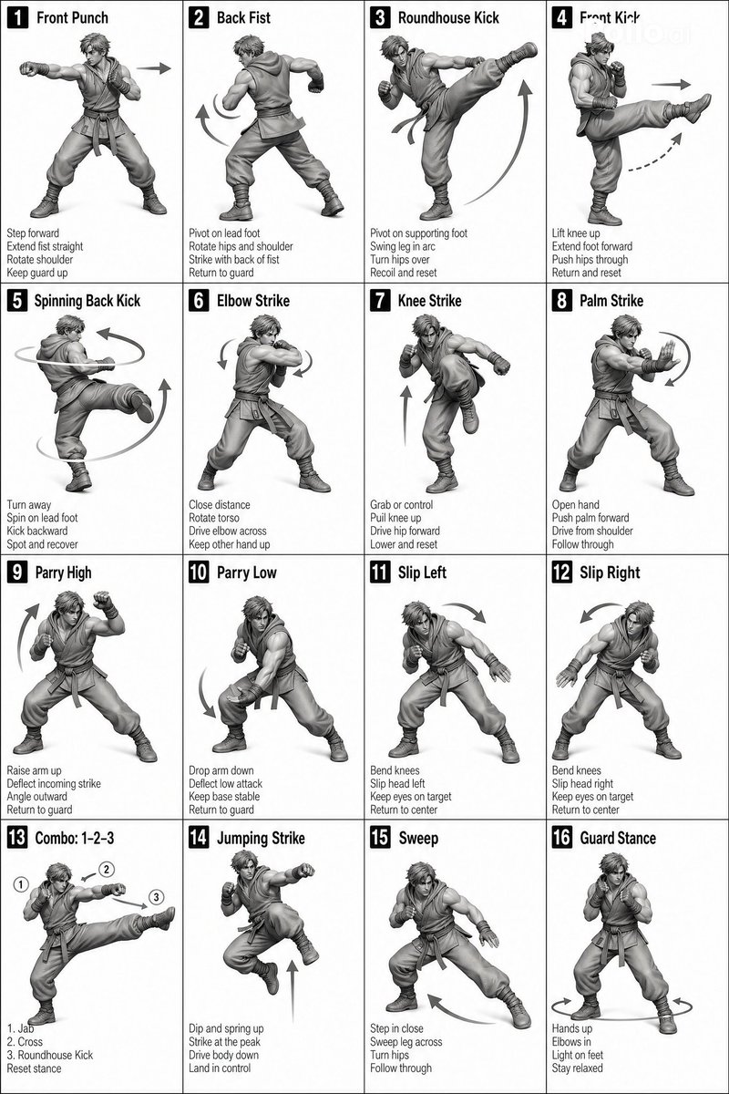
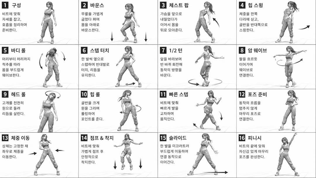
How The Prompt Is Structured
- The prompt reads as a long, highly specified prompt, which is useful when you want to judge how much specificity this direction needs.
- Its keyword cluster is centered on Illustration, Character, Typography, so you can usually keep that cluster while swapping subject, camera, layout, or copy details.
- A practical rewrite path is: keep the outcome, keep the strongest style cues, then replace only the subject and environment blocks.
Good Follow-up Questions
- What changes first if you keep Illustration, Character, Typography but switch the subject matter?
- Which part of the result comes from section-level structure (Character Design) versus tag-level style cues?
- Which related cases in the same section give you a cleaner or more extreme variation of the same direction?
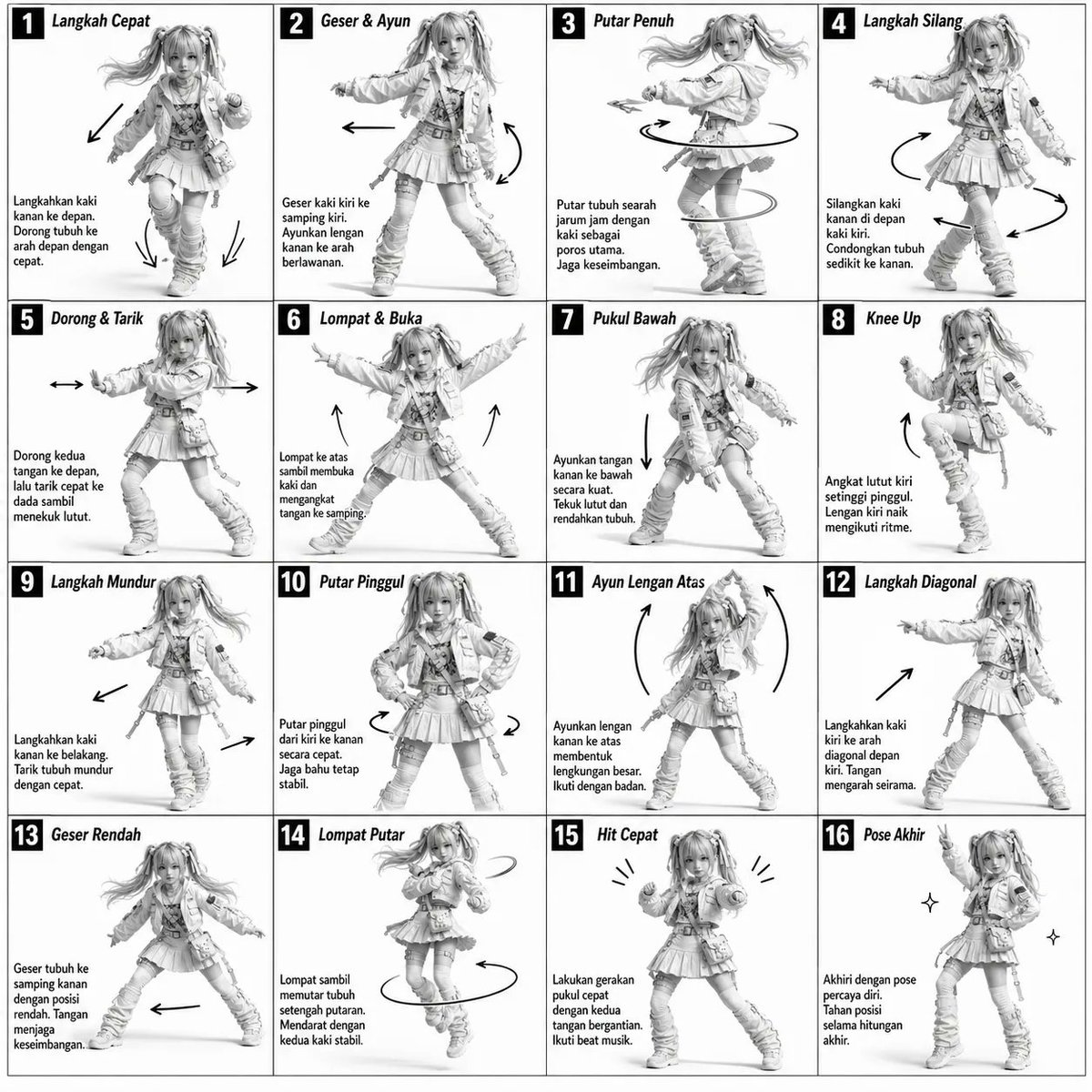
Full Prompt
Monochromatic grayscale illustration, 3D-rendered character, clean instructional reference sheet. White background, comic-style cell grid layout, technical diagram aesthetic. [LAYOUT] 4×4 grid layout (16 panels total). Each panel separated by thin black border lines. Panels are evenly sized and consistently aligned. Each cell is clearly numbered from 1 to 16. [CHARACTER] {argument name="subject" default="Young female dancer with an athletic build, ponytail hairstyle, wearing a crop top, baggy pants, and sneakers"}. The same character must appear consistently in all panels. [PANEL STRUCTURE – per cell] Top-left: bold number badge + {argument name="language" default="Korean"} title text Center: full-body character pose illustration Bottom-left: {argument name="language" default="Korean"} description text (3–4 lines) Overlay: directional arrows indicating movement flow [ARROWS / MOTION INDICATORS] Curved arrows, straight arrows, and circular rotation indicators. Arrows should be placed around the character to clearly show movement direction and flow. [RENDERING STYLE] Highly detailed 3D sculpted style. Soft studio lighting with subtle shadows. No color — grayscale only. Clean linework, polished finish, game concept art quality. [NEGATIVE PROMPT] No background scenery. No color tones. No additional characters. No cluttered or complex backgrounds.