Case Media
Case Notes
This page keeps the media, full prompt, and original source together so you can inspect the result first and decide whether the prompt is worth copying, saving, or comparing.
Case Insights
To make this page easier to search, cite, and reuse later, the case is also broken down into practical guidance about usage, visual cues, and prompt structure.
Best Fit Scenarios
- Use this as a character design benchmark when you need a fast style baseline before rewriting your own prompt.
- It is especially helpful if your target overlaps with Poster, Illustration, Character and you want to judge the image result before tuning wording.
- Keep it as a control sample when you compare nearby prompt variants one variable at a time.
Visual Signals To Notice
- The clearest style signals here are Poster, Illustration, Character, so those should usually stay in your first rewrite.
- Look at silhouette, costume language, mood styling, and whether the character reads clearly at a glance.
- This case keeps one primary output, so the first image should be treated as the main visual reference.
How The Prompt Is Structured
- The prompt reads as a long, highly specified prompt, which is useful when you want to judge how much specificity this direction needs.
- Its keyword cluster is centered on Poster, Illustration, Character, so you can usually keep that cluster while swapping subject, camera, layout, or copy details.
- A practical rewrite path is: keep the outcome, keep the strongest style cues, then replace only the subject and environment blocks.
Good Follow-up Questions
- What changes first if you keep Poster, Illustration, Character but switch the subject matter?
- Which part of the result comes from section-level structure (Character Design) versus tag-level style cues?
- Which related cases in the same section give you a cleaner or more extreme variation of the same direction?
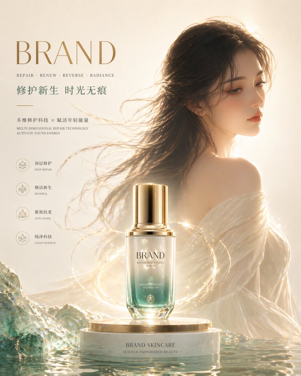
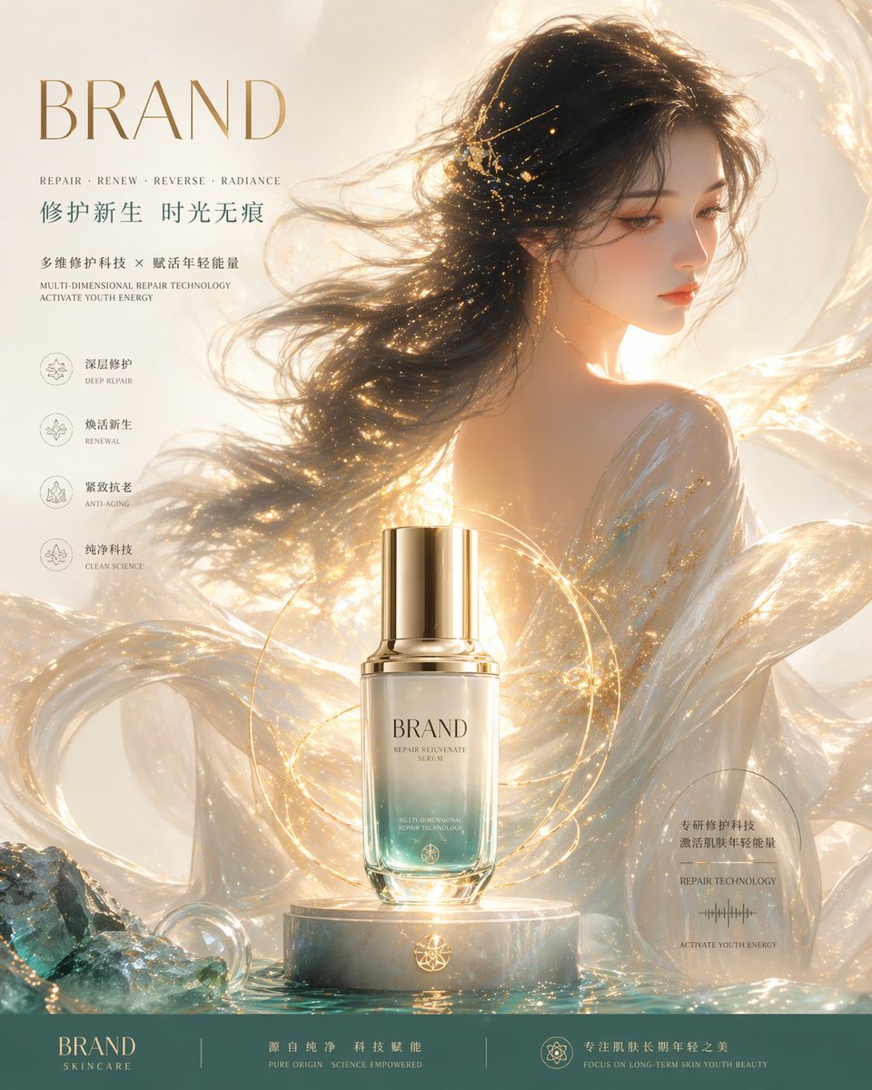
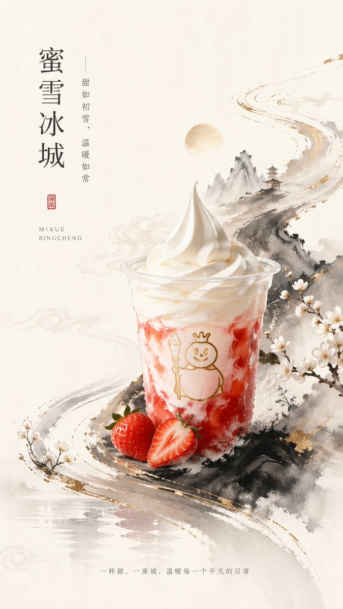
Full Prompt
A premium vertical poster advertisement in elegant new Chinese aesthetics, featuring a single plastic cup of strawberry sundae-style ice cream drink as the central product. The cup is placed slightly below center, shot straight-on with soft studio lighting, with glossy white swirled soft serve on top, creamy white layers marbled with vivid strawberry-red streaks inside the cup, and a simple gold line-art mascot printed on the front. In front of the cup are exactly 2 strawberries: 1 whole strawberry and 1 halved strawberry with the cut face visible. The background is a warm ivory rice-paper texture with large areas of negative space. Surround the product with an ink-wash Chinese landscape composition: misty gray-black mountains, a winding brushstroke-like river or road flowing diagonally from lower left to upper right, subtle gold foil accents along the brush edges, a pale circular sun or moon near the upper middle, a small traditional pagoda on a mountain ridge, soft drifting cloud motifs, and blooming white plum blossoms on branches at the right edge and lower left corner. The overall palette is off-white, black ink gray, soft beige, gold, and strawberry red, balancing minimalism and luxury. Add vertical Chinese typography on the upper left with the large main title {argument name="headline text" default="蜜雪冰城"}, and a thinner vertical tagline beside it reading {argument name="tagline text" default="甜如初雪,温暖如常"}. Beneath that, place a small red seal stamp with Chinese characters, and below it a small uppercase serif-style Latin brand line reading {argument name="brand text" default="MIXUE BINGCHENG"}. At the bottom center, add one line of small Chinese slogan text reading {argument name="footer text" default="一杯甜,一座城,温暖每一个平凡的日常"}. Refined commercial poster design, high detail product realism, painterly ink illustration fusion, clean luxury layout, no extra products, no people, no busy background.