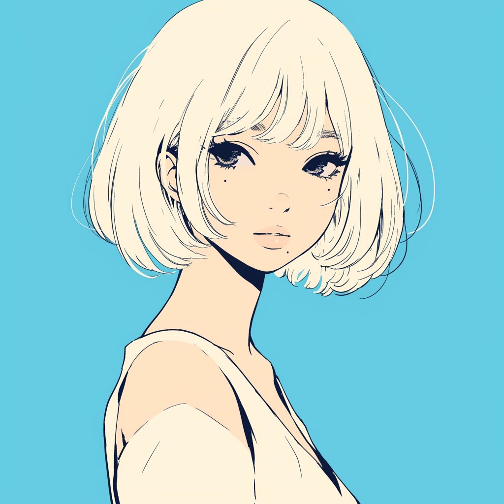
Case Media
Case Notes
This page keeps the media, full prompt, and original source together so you can inspect the result first and decide whether the prompt is worth copying, saving, or comparing.
Case Insights
To make this page easier to search, cite, and reuse later, the case is also broken down into practical guidance about usage, visual cues, and prompt structure.
Best Fit Scenarios
- Use this as a character design benchmark when you need a fast style baseline before rewriting your own prompt.
- It is especially helpful if your target overlaps with Fashion, Poster, Illustration and you want to judge the image result before tuning wording.
- Keep it as a control sample when you compare nearby prompt variants one variable at a time.
Visual Signals To Notice
- The clearest style signals here are Fashion, Poster, Illustration, so those should usually stay in your first rewrite.
- Look at silhouette, costume language, mood styling, and whether the character reads clearly at a glance.
- This case keeps one primary output, so the first image should be treated as the main visual reference.
How The Prompt Is Structured
- The prompt reads as a long, highly specified prompt, which is useful when you want to judge how much specificity this direction needs.
- Its keyword cluster is centered on Fashion, Poster, Illustration, so you can usually keep that cluster while swapping subject, camera, layout, or copy details.
- A practical rewrite path is: keep the outcome, keep the strongest style cues, then replace only the subject and environment blocks.
Good Follow-up Questions
- What changes first if you keep Fashion, Poster, Illustration but switch the subject matter?
- Which part of the result comes from section-level structure (Character Design) versus tag-level style cues?
- Which related cases in the same section give you a cleaner or more extreme variation of the same direction?
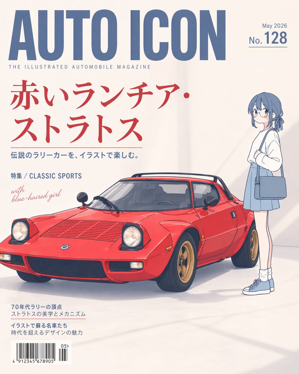
Full Prompt
A clean editorial magazine cover on an off-white studio background, designed like a premium illustrated automobile magazine. The main headline at the top is huge condensed blue sans-serif text reading {argument name="magazine title" default="AUTO ICON"}, with a small subtitle beneath it reading "THE ILLUSTRATED AUTOMOBILE MAGAZINE". In the top right, place small blue issue text reading {argument name="issue date" default="May 2026"} above a larger blue number line reading "No.128" with a thin underline. The central feature is a beautifully illustrated classic {argument name="car model" default="red Lancia Stratos"}, shown in a front three-quarter view facing left, low and wedge-shaped, bright glossy red paint, black roof spoiler, pop-up headlights raised, detailed vents on the hood, black grille, gold wheels, realistic tires, and subtle reflections and shadows on the floor. To the right of the car stands a slim anime-style {argument name="companion character" default="blue-haired girl"}, full body, facing left toward the car, short muted blue bob haircut with a small tied section in back, minimalist facial detail, white long-sleeve top, pale blue skirt, white socks, blue sneakers, and a blue shoulder bag, posed casually with one arm bent near her chest. Use a refined blend of soft cel-shaded anime illustration and realistic automotive rendering, with lots of negative space and elegant print-layout balance. Add large red Japanese cover text on the left in two lines reading {argument name="main cover line" default="赤いランチア・ストラトス"}, with a smaller blue Japanese subheading beneath it reading "伝説のラリーカーを、イラストで楽しむ。" Add another small blue line reading "特集 / CLASSIC SPORTS" and a handwritten-style light red note saying "with blue-haired girl". At the bottom left, include two blocks of small Japanese cover copy and a realistic barcode with tiny issue digits. Keep the overall aesthetic minimal, sophisticated, airy, and poster-like, with soft daylight shadows and a high-end Japanese magazine cover composition.