Case Media
Case Notes
This page keeps the media, full prompt, and original source together so you can inspect the result first and decide whether the prompt is worth copying, saving, or comparing.
Case Insights
To make this page easier to search, cite, and reuse later, the case is also broken down into practical guidance about usage, visual cues, and prompt structure.
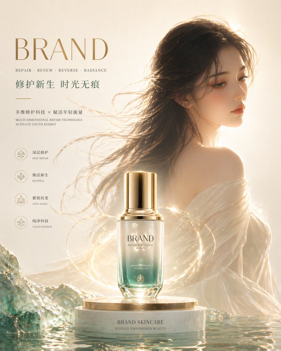
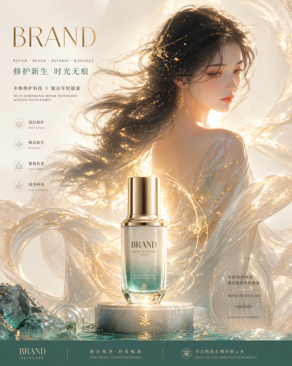
Best Fit Scenarios
- Use this as a character design benchmark when you need a fast style baseline before rewriting your own prompt.
- It is especially helpful if your target overlaps with Fashion, Poster, Character and you want to judge the image result before tuning wording.
- Keep it as a control sample when you compare nearby prompt variants one variable at a time.
Visual Signals To Notice
- The clearest style signals here are Fashion, Poster, Character, so those should usually stay in your first rewrite.
- Look at silhouette, costume language, mood styling, and whether the character reads clearly at a glance.
- This case keeps one primary output, so the first image should be treated as the main visual reference.
How The Prompt Is Structured
- The prompt reads as a long, highly specified prompt, which is useful when you want to judge how much specificity this direction needs.
- Its keyword cluster is centered on Fashion, Poster, Character, so you can usually keep that cluster while swapping subject, camera, layout, or copy details.
- A practical rewrite path is: keep the outcome, keep the strongest style cues, then replace only the subject and environment blocks.
Good Follow-up Questions
- What changes first if you keep Fashion, Poster, Character but switch the subject matter?
- Which part of the result comes from section-level structure (Character Design) versus tag-level style cues?
- Which related cases in the same section give you a cleaner or more extreme variation of the same direction?
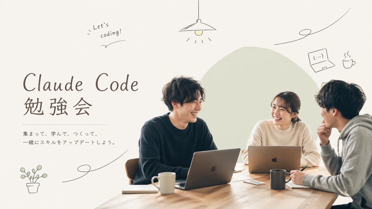
Full Prompt
A clean, warm, minimalist promotional poster for a coding study meetup, in a soft lifestyle-photography plus editorial design style. Show 3 young adults seated around a light wooden table in a bright neutral room, collaborating with laptops and notebooks. The group consists of 2 men and 1 woman, all casually dressed in muted colors; the person on the left wears a dark navy sweater, the woman in the center-right wears an off-white knit top, and the person on the far right wears a light gray hoodie in side profile. Their faces are softly obscured and not detailed. Place 2 open silver laptops on the table, 2 ceramic mugs, 2 notebooks, 1 smartphone, and 1 pen visible near the right person’s hand. Compose the people on the right half of the image, with a large pale sage-green organic blob shape behind them as a graphic backdrop. Keep the lighting soft, natural, airy, and slightly warm, with lots of negative space on the left. On the left side, add large elegant headline typography reading {argument name="headline text" default="Claude Code"} on one line and {argument name="subheadline text" default="勉強会"} below it in large Japanese characters. Under the headline, add a thin dotted horizontal divider line, then 2 lines of smaller Japanese body text reading {argument name="body text" default="集まって、学んで、つくって、\n一緒にスキルをアップデートしよう。"}. Add playful hand-drawn doodles in thin dark lines around the layout: 1 hanging lamp centered near the top, 1 handwritten note in the upper left saying {argument name="note text" default="Let’s coding!"}, 1 small laptop icon in the upper right, 1 steaming coffee cup icon beside it, 1 potted plant icon in the lower left, and 3 long curving decorative squiggle lines distributed across the page. Use an off-white background, restrained Japanese cafe-meets-tech branding, balanced whitespace, and a polished social-media event flyer aesthetic with a 16:9 horizontal composition.