Case Media
Case Notes
This page keeps the media, full prompt, and original source together so you can inspect the result first and decide whether the prompt is worth copying, saving, or comparing.
Case Insights
To make this page easier to search, cite, and reuse later, the case is also broken down into practical guidance about usage, visual cues, and prompt structure.
Best Fit Scenarios
- Use this as a character design benchmark when you need a fast style baseline before rewriting your own prompt.
- It is especially helpful if your target overlaps with Fashion, Poster, Illustration and you want to judge the image result before tuning wording.
- Keep it as a control sample when you compare nearby prompt variants one variable at a time.
Visual Signals To Notice
- The clearest style signals here are Fashion, Poster, Illustration, so those should usually stay in your first rewrite.
- Look at silhouette, costume language, mood styling, and whether the character reads clearly at a glance.
- This case keeps 2 media outputs, which makes it easier to check whether the style remains stable across multiple results.
How The Prompt Is Structured
- The prompt reads as a long, highly specified prompt, which is useful when you want to judge how much specificity this direction needs.
- Its keyword cluster is centered on Fashion, Poster, Illustration, so you can usually keep that cluster while swapping subject, camera, layout, or copy details.
- A practical rewrite path is: keep the outcome, keep the strongest style cues, then replace only the subject and environment blocks.
Good Follow-up Questions
- What changes first if you keep Fashion, Poster, Illustration but switch the subject matter?
- Which part of the result comes from section-level structure (Character Design) versus tag-level style cues?
- Which related cases in the same section give you a cleaner or more extreme variation of the same direction?
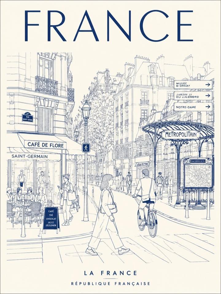
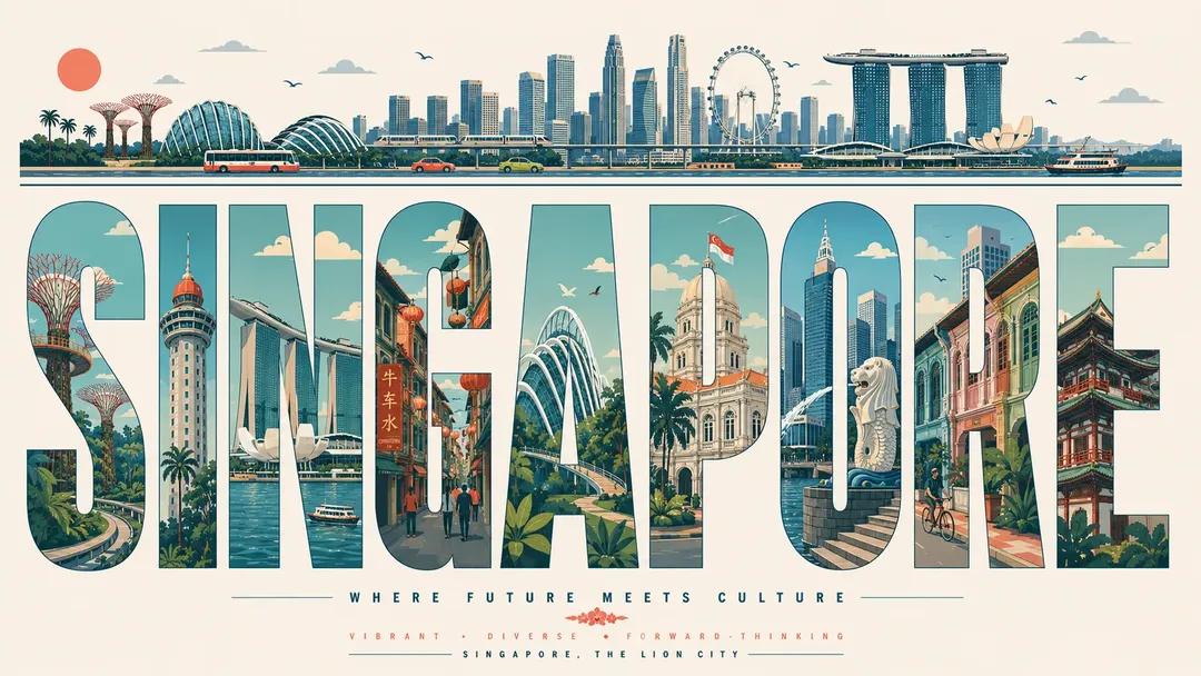
Full Prompt
Create an ultra-high-resolution typography-based travel poster design themed around [CITY NAME]. Aspect ratio: (16:9 poster) IMPORTANT: All visible text inside the poster must be in English only. Typography must be perfectly spelled and professionally typeset. Absolutely no distorted letters, random symbols, broken text, or AI-generated gibberish. Aspect ratio: 16:9 poster CORE COMPOSITION: Place the giant English word “[CITY_NAME]” prominently in the center of the composition Each individual letter should contain a different illustrated scene from the city Letters should be tall, elongated, bold sans-serif forms The typography itself should feel like a series of “city gallery windows” Distribute landmarks, streets, transportation, nature, culture, and architecture naturally across the letters Scenes should visually flow from one letter into another like one connected urban panorama TOP HORIZONTAL STRIP: At the top of the poster, include a thin panoramic horizontal strip containing: city skyline silhouettes cars trams or trains boats if relevant birds clouds sun All elements should appear minimalist, elegant, and rhythmically balanced. STYLE: mid-century modern editorial poster, Swiss graphic design, minimal vector illustration, architectural infographic aesthetic, travel typography poster, flat geometric illustration, ultra clean composition, premium magazine design, screen print poster feeling, retro-futuristic travel branding ILLUSTRATION STYLE: flat vector shapes only no realism no gradients no texture noise clean geometric shadows simplified architectural forms map-like top-down illustration mixed with side-view cityscape subtle line-art details perfectly clean vector edges strong negative space usage harmonious visual rhythm between letters TYPOGRAPHY: giant bold sans-serif typography letters occupy most of the canvas height ultra precise alignment each letter acts as an independent framed illustration panel smooth rounded corners where appropriate editorial spacing highly balanced composition typography must look professionally designed, print-ready, and geometrically perfect COLOR PALETTE: Automatically derive a cohesive palette inspired by [CITY_NAME]. Examples: coastal city → aqua, sand, coral, muted teal desert city → terracotta, beige, warm cream cyber city → mint, navy, steel blue historic European city → dusty rose, olive green, parchment Use: muted pastel tones soft vintage travel poster colors elegant low-saturation combinations maximum 4–6 colors only CONTENT GENERATION: Automatically include: iconic landmarks of [CITY_NAME] famous streets and transportation local urban patterns nearby nature elements skyline silhouettes bridges, rivers, or coastline if relevant culturally symbolic architecture recognizable local atmosphere COMPOSITION: centered typography composition white or soft ivory background lots of breathing room top panoramic strip balances the heavy typography below asymmetrical but visually balanced layout each letter contains different scene depth and perspective premium poster hierarchy with museum-quality layout MOOD: premium, intellectual, calm, design-forward, travel editorial aesthetic, stylish enough for a museum gift shop poster QUALITY: 8K ultra detailed, print-ready, extremely sharp vector edges, perfect typography rendering, clean professional graphic design, high-end editorial poster quality, no distorted text, no random characters, no spelling errors, no AI artifacts