Case Media
Case Notes
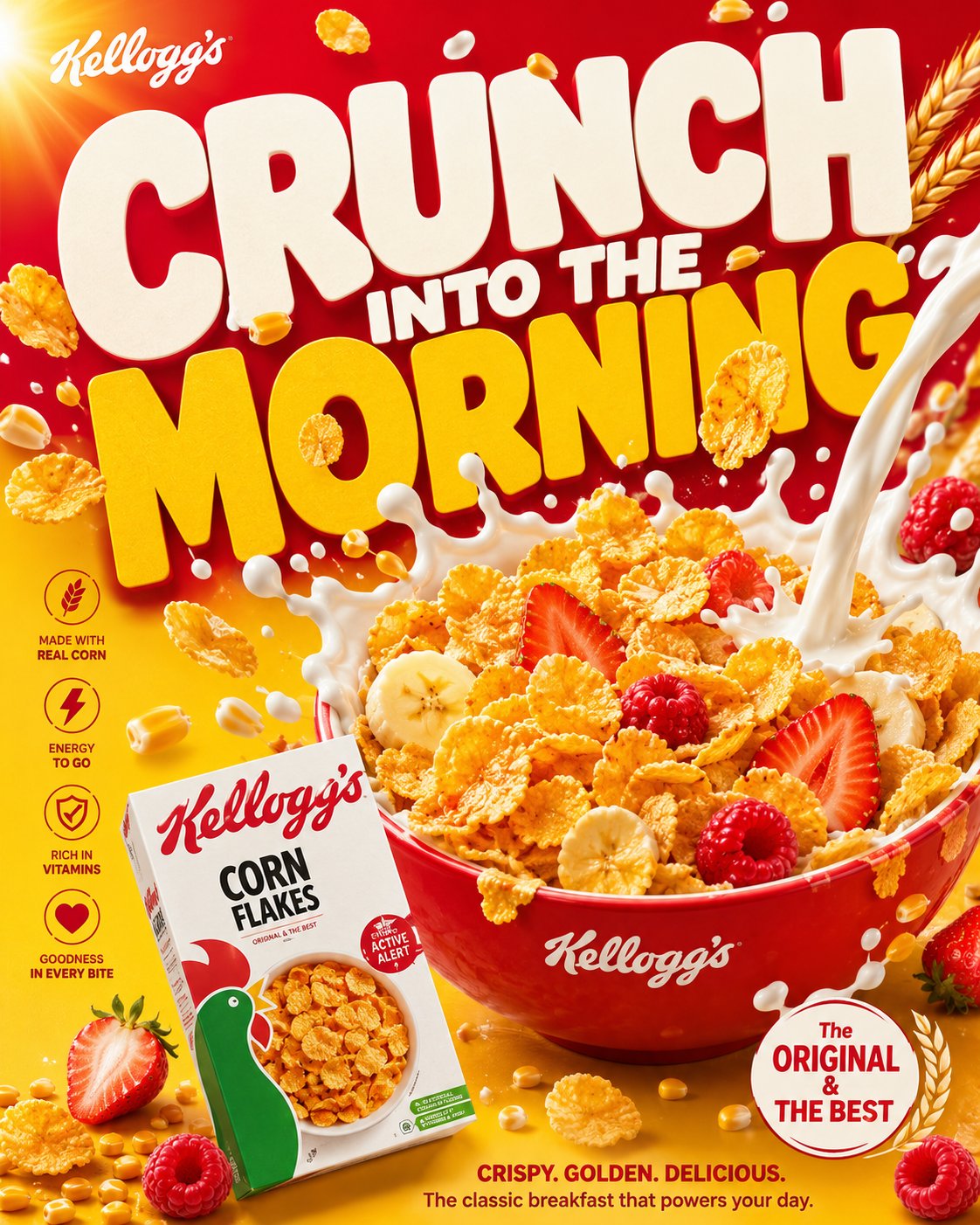
This page keeps the media, full prompt, and original source together so you can inspect the result first and decide whether the prompt is worth copying, saving, or comparing.
Case Insights
To make this page easier to search, cite, and reuse later, the case is also broken down into practical guidance about usage, visual cues, and prompt structure.
Best Fit Scenarios
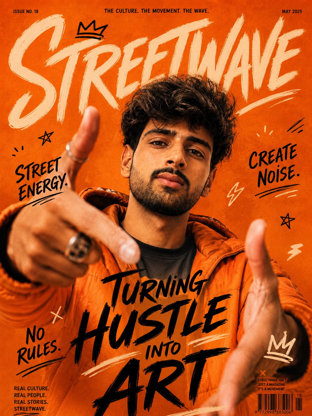
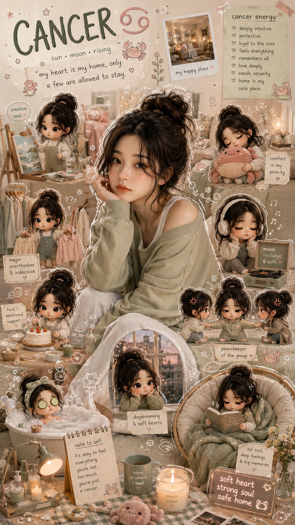
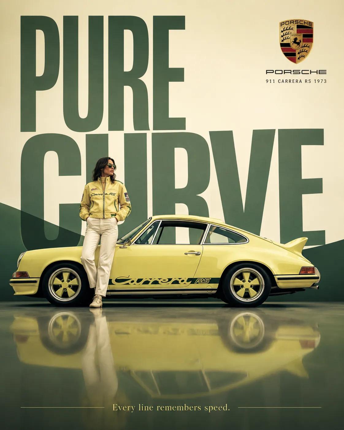
- Use this as a character design benchmark when you need a fast style baseline before rewriting your own prompt.
- It is especially helpful if your target overlaps with Cinematic, Fashion, Poster and you want to judge the image result before tuning wording.
- Keep it as a control sample when you compare nearby prompt variants one variable at a time.
Visual Signals To Notice
- The clearest style signals here are Cinematic, Fashion, Poster, so those should usually stay in your first rewrite.
- Look at silhouette, costume language, mood styling, and whether the character reads clearly at a glance.
- This case keeps 2 media outputs, which makes it easier to check whether the style remains stable across multiple results.
How The Prompt Is Structured
- The prompt reads as a long, highly specified prompt, which is useful when you want to judge how much specificity this direction needs.
- Its keyword cluster is centered on Cinematic, Fashion, Poster, so you can usually keep that cluster while swapping subject, camera, layout, or copy details.
- A practical rewrite path is: keep the outcome, keep the strongest style cues, then replace only the subject and environment blocks.
Good Follow-up Questions
- What changes first if you keep Cinematic, Fashion, Poster but switch the subject matter?
- Which part of the result comes from section-level structure (Character Design) versus tag-level style cues?
- Which related cases in the same section give you a cleaner or more extreme variation of the same direction?
Full Prompt
**GOLDEN MORN VIRAL FMCG POSTER CAMPAIGN SYSTEM** **“START GOLDEN. STAY STRONG.”** ACT AS: A senior global FMCG creative director, luxury breakfast food stylist, premium commercial product photographer, typography designer, and modern brand advertiser creating a viral Golden Morn breakfast campaign poster for a world-class cereal brand. The design should feel like a fusion of: — premium breakfast FMCG campaigns — modern cereal advertisements — healthy lifestyle branding — vibrant Instagram food editorials — bold typography-driven poster design — colorful family-friendly commercial aesthetics The poster should feel: fresh, healthy, energetic, warm, premium, uplifting, appetizing, highly shareable. NOT cinematic fantasy. NOT dark luxury aesthetics. NOT junk-food advertising. NOT cluttered chaos. NOT flat supermarket catalog design. This should look like a real billion-dollar Golden Morn campaign created by a top-tier global advertising agency. --- # CORE CREATIVE STYLE The overall visual language should combine: — oversized statement typography — dynamic breakfast ingredient motion — ultra-clean food presentation — premium commercial color grading — modern FMCG realism — vibrant healthy-food energy — bold graphic layout aesthetics The design should instantly feel: modern, healthy, premium, family-friendly, commercial, Instagram-ready. Everything should feel intentionally art-directed and globally recognizable. --- # TYPOGRAPHY STYLE (MOST IMPORTANT) Use HUGE oversized retro-modern typography dominating the background. Typography should: — occupy 40–60% of the composition — sit behind and around the cereal bowl — feel bold and uplifting — immediately attract attention Font characteristics: — ultra-bold — rounded edges — chunky soft forms — retro-modern style — thick sans-serif letterforms — playful but premium — smooth curves — tight spacing Typography inspiration: — premium cereal campaigns — retro supermarket graphics — healthy lifestyle branding — modern FMCG poster systems Example headline structures: “START GOLDEN” “MORNING ENERGY” “POWER YOUR DAY” “GOODNESS INSIDE” “BREAKFAST DONE RIGHT” Typography should interact naturally with: — floating grains — milk splashes — bananas — cereal particles — honey drips Text color should strongly contrast the background: — cream or white typography works beautifully on rich golden or sky-blue backgrounds. --- # MAIN PRODUCT COMPOSITION Create a hyper-realistic bowl of creamy Golden Morn cereal dramatically placed in the foreground. The cereal should appear: warm, smooth, nutritious, creamy, comforting, premium. Surround the bowl with vibrant breakfast ingredients such as: — sliced bananas — maize grains — soybeans — oats — honey drizzle — milk splashes — floating cereal dust — fresh fruits Show luxurious food textures including: — creamy cereal swirls — glossy milk highlights — honey reflections — grain textures — soft steam glow The composition should feel frozen mid-motion like a premium commercial breakfast shoot. --- # FOOD PHOTOGRAPHY STYLE Professional luxury commercial breakfast photography. Focus on: — creamy textures — glossy milk reflections — rich grain detail — natural freshness — premium lighting realism — healthy appetizing presentation The cereal should look: freshly made, warm, smooth, nourishing, Instagram-worthy. Lighting should resemble: premium global FMCG breakfast campaigns. --- # LIGHTING Use bright premium commercial studio lighting. Lighting characteristics: — creamy highlights — glossy reflections — warm morning glow — clean natural shadows — vibrant healthy contrast — premium food shine Avoid dark moody lighting. The lighting should create: fresh morning energy and warmth. --- # BACKGROUND STYLE Use a bold seamless studio background. Preferred colors: — rich golden yellow — warm cream beige — sky blue — soft honey gold — fresh white highlights — subtle maize tones Background should feel: clean, healthy, graphic, bright, uplifting. Add: — soft sunlight glow — floating grain particles — subtle milk splash trails — light gradient falloff Avoid cluttered kitchen scenes. --- # COLOR SYSTEM Use vibrant premium breakfast colors. Color palette should feel: healthy, fresh, warm, energetic, family-friendly. Main colors: — golden yellow — creamy beige — fresh sky blue — honey gold — soft white — natural grain tones Use strong contrast between: — typography — cereal bowl — background — ingredients Everything should feel perfectly color-coordinated. --- # COMPOSITION RULES Strong visual hierarchy. Layer order: 1. Oversized typography background 2. Floating breakfast ingredients 3. Hero cereal bowl 4. Milk splashes & grain motion 5. Golden Morn packaging Use: — layered depth — diagonal ingredient motion — overlapping elements — floating particles — energetic motion flow The poster should feel lively, healthy, and dynamic. Avoid dead empty space. --- # PRODUCT PACKAGING Include realistic Golden Morn packaging naturally integrated into the composition. Packaging should: — look glossy and authentic — maintain the iconic blue-and-yellow branding — support the visual hierarchy — feel premium and trustworthy Placement: — lower foreground — side composition — partially integrated into ingredient motion Do not overpower the cereal bowl. --- # EMOTIONAL GOAL The viewer should instantly think: “I want this every morning.” Mood: healthy, premium, comforting, energetic, family-friendly, modern FMCG vitality. --- # FINAL VISUAL QUALITY Ultra photorealistic. Premium commercial breakfast photography. Modern FMCG campaign realism. Luxury Instagram advertisement quality. Billboard-ready composition. Hyper-detailed food textures. Sharp oversized typography. Rich vibrant color grading. Crisp splash and ingredient effects. Aspect Ratio: 4:5 Ultra HD 8K High-detail commercial rendering Global advertising campaign quality