Case Media
Case Notes
This page keeps the media, full prompt, and original source together so you can inspect the result first and decide whether the prompt is worth copying, saving, or comparing.
Case Insights
To make this page easier to search, cite, and reuse later, the case is also broken down into practical guidance about usage, visual cues, and prompt structure.
Best Fit Scenarios
- Use this as a character design benchmark when you need a fast style baseline before rewriting your own prompt.
- It is especially helpful if your target overlaps with Neon, Poster, Screenshot and you want to judge the image result before tuning wording.
- Keep it as a control sample when you compare nearby prompt variants one variable at a time.
Visual Signals To Notice
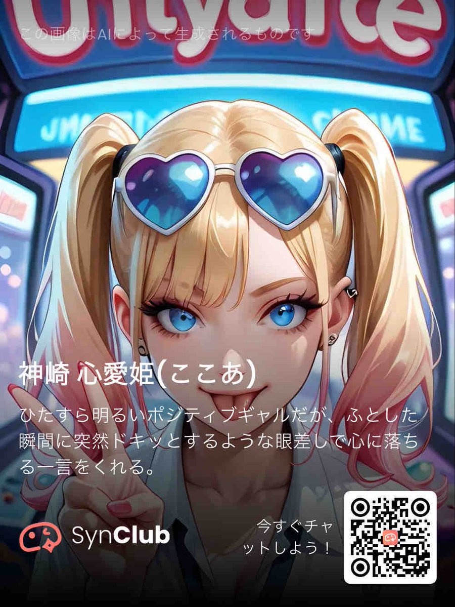
- The clearest style signals here are Neon, Poster, Screenshot, so those should usually stay in your first rewrite.
- Look at silhouette, costume language, mood styling, and whether the character reads clearly at a glance.
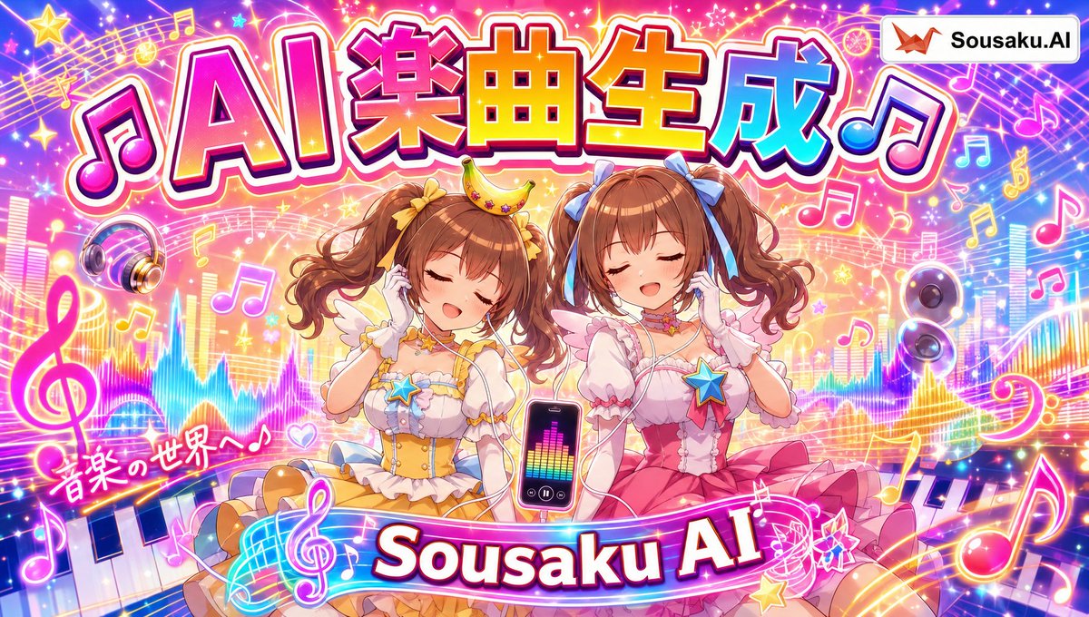
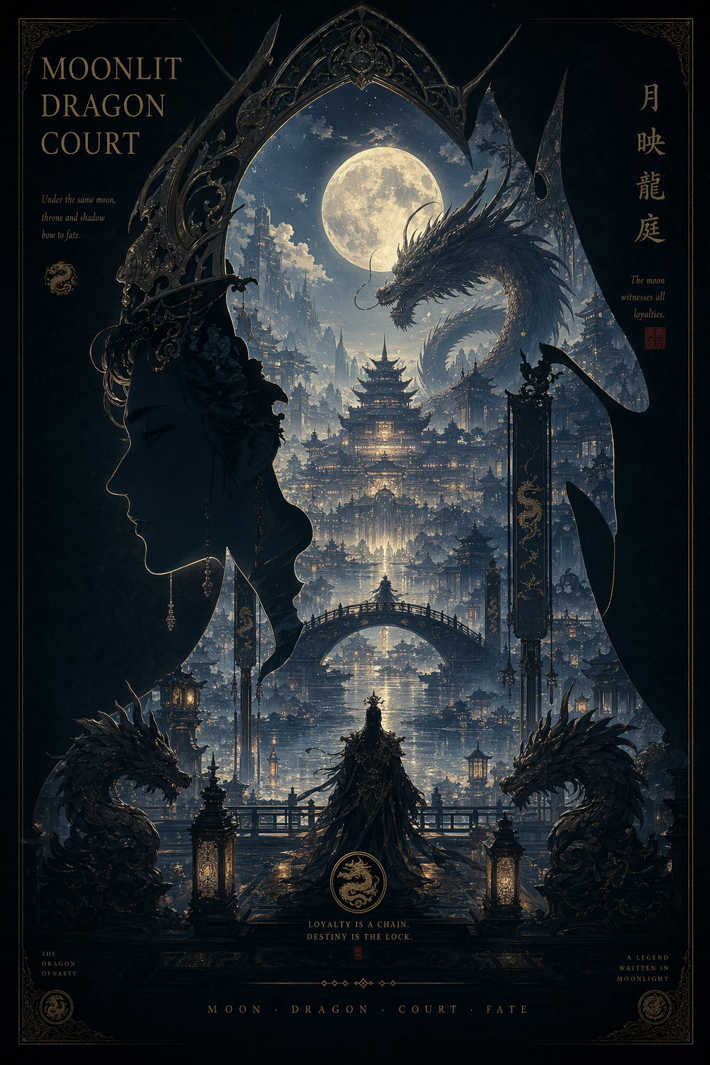
- This case keeps 2 media outputs, which makes it easier to check whether the style remains stable across multiple results.
How The Prompt Is Structured
- The prompt reads as a long, highly specified prompt, which is useful when you want to judge how much specificity this direction needs.
- Its keyword cluster is centered on Neon, Poster, Screenshot, so you can usually keep that cluster while swapping subject, camera, layout, or copy details.
- A practical rewrite path is: keep the outcome, keep the strongest style cues, then replace only the subject and environment blocks.
Good Follow-up Questions
- What changes first if you keep Neon, Poster, Screenshot but switch the subject matter?
- Which part of the result comes from section-level structure (Character Design) versus tag-level style cues?
- Which related cases in the same section give you a cleaner or more extreme variation of the same direction?
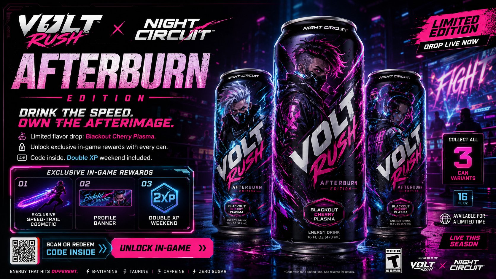
Full Prompt
Create a premium, highly believable Energy Drink x Game Collab Ad for an imaginary crossover between [DRINK BRAND NAME] and [GAME / FRANCHISE NAME]. The goal is to make the collaboration feel like a real, high-hype limited campaign: instantly collectible, culturally sharp, commercially believable, and built to spread across gaming, retail, and internet culture. It should feel like an official promo visual for a co-branded flavor, can design, and in-game reward event. Collab details: - Drink brand name: [DRINK BRAND NAME] - Game / franchise name: [GAME OR FRANCHISE] - Collab name: [CAMPAIGN OR PRODUCT NAME] - Product type: [ENERGY DRINK / ZERO SUGAR ENERGY DRINK / GAMING BOOST DRINK / LIMITED FLAVOR] - Core concept: [WHAT MAKES THE COLLAB SPECIAL] - Flavor concept: [FLAVOR NAME OR PROFILE] - In-game tie-in: [SKIN / XP BOOST / BONUS ITEM / CODE REWARD / BUNDLE / EVENT ACCESS] - Main fantasy: [WHY PEOPLE WANT TO BUY IT] - Audience: [AUDIENCE] - Tone: [HYPED / PREMIUM / CHAOTIC / AGGRESSIVE / ELECTRIC / COOL / COLLECTIBLE / ESPORTS] - Cultural vibe: [ESPORTS / ANIME GAME / SHOOTER CULTURE / STREETWEAR / GACHA / CYBER / Y2K ENERGY / LIVE-SERVICE EVENT] - Reality level: [BELIEVABLE RETAIL COLLAB / BELIEVABLE LIVE GAME PROMO / STYLIZED BUT REAL / DEADPAN FICTIONAL] Ad structure: Build the visual like an official crossover campaign poster. Include sections such as: - hero can or bottle visual - collab logo lockup - game or franchise branding - flavor name - short campaign tagline - limited-edition callout - in-game reward preview - optional code redemption cue - optional pack size or nutrition badge - optional event window - optional “collect all variants” message - optional retail or preorder cue For the copy, include: - one strong collab headline - 1 to 3 support lines - language that feels native to gaming and product-marketing culture - a balance between commercial clarity and internet hype - wording that feels official and highly shareable Include: - a strong co-branded title treatment - premium product-shot hierarchy - believable crossover branding - clear product + reward logic - strong retail-launch energy - polished event cues - collectible desirability - instantly shareable gamer-product hype Visual direction: - Make the ad feel like a real limited-edition collab people would buy for both the drink and the code inside - Emphasize collectibility, event urgency, cool factor, and cross-brand identity - Balance product-commercial realism with entertainment-world fantasy - Make it suitable for convenience-store promos, digital launch ads, in-game event banners, or esports sponsorship visuals - The result should look like a genuine mainstream crossover campaign Art direction: - Style: [ENERGY DRINK CAMPAIGN / GAMING COLLAB POSTER / ESPORTS PRODUCT AD / HYPE RETAIL VISUAL / CYBER COMMERCIAL / ANIME CROSSOVER AD] - Color palette: [PALETTE] - Typography feel: [BOLD HYPE SANS / ESPORTS DISPLAY / SHARP SCI-FI / GAMING EVENT TYPE / RETAIL CAMPAIGN LETTERING] - Material feel: [RETAIL POSTER / DIGITAL CAMPAIGN VISUAL / STORE DISPLAY / EVENT BANNER / PRODUCT DROP SHEET] - Lighting or image mood: [ELECTRIC / NEON / METALLIC / HIGH-CONTRAST / GLOWING / ENERGY-BURST] - Background: [ARENA LIGHTS / DIGITAL VOID / GAME WORLD / HYPER COLOR FIELD / INDUSTRIAL STAGE / CYBER GRID] Composition: - Show the ad as one cohesive crossover-campaign image - Make the drink, collab branding, and reward hook instantly readable - Use real commercial ad hierarchy and believable co-brand structure - Make the collab feel desirable, limited, and culturally current - Make the final output feel like a premium fake crossover ad with viral potential Output quality: - ultra-detailed - visually structured - commercially believable - culturally fluent - polished crossover styling - strong hierarchy and spacing - premium product-campaign composition - instantly shareable visual concept Optional content blocks: - redeem code strip - XP boost badge - collectible can variants - limited flavor marker - “while supplies last” line - event countdown - multi-pack preview - sponsored tournament badge - exclusive skin preview - QR code Avoid: - generic product placement - weak co-branding - fake-looking can design - cluttered layout - random typography choices - amateur retail aesthetics - too much text fighting the hero product - obvious parody unless intentionally chosen