Case Media
Case Notes
This page keeps the media, full prompt, and original source together so you can inspect the result first and decide whether the prompt is worth copying, saving, or comparing.
Case Insights
To make this page easier to search, cite, and reuse later, the case is also broken down into practical guidance about usage, visual cues, and prompt structure.
Best Fit Scenarios
- Use this as a character design benchmark when you need a fast style baseline before rewriting your own prompt.
- It is especially helpful if your target overlaps with Cinematic, Fashion, Poster and you want to judge the image result before tuning wording.
- Keep it as a control sample when you compare nearby prompt variants one variable at a time.
Visual Signals To Notice
- The clearest style signals here are Cinematic, Fashion, Poster, so those should usually stay in your first rewrite.
- Look at silhouette, costume language, mood styling, and whether the character reads clearly at a glance.
- This case keeps one primary output, so the first image should be treated as the main visual reference.
How The Prompt Is Structured
- The prompt reads as a long, highly specified prompt, which is useful when you want to judge how much specificity this direction needs.
- Its keyword cluster is centered on Cinematic, Fashion, Poster, so you can usually keep that cluster while swapping subject, camera, layout, or copy details.
- A practical rewrite path is: keep the outcome, keep the strongest style cues, then replace only the subject and environment blocks.
Good Follow-up Questions
- What changes first if you keep Cinematic, Fashion, Poster but switch the subject matter?
- Which part of the result comes from section-level structure (Character Design) versus tag-level style cues?
- Which related cases in the same section give you a cleaner or more extreme variation of the same direction?
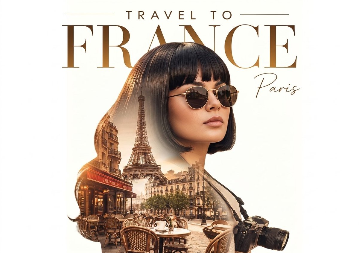
Full Prompt
A high-end cinematic travel poster featuring a professional double exposure composition. Use a provided reference image for the character’s face structure and hairstyle. The subject is a beautiful woman with long curly hair and round gold-rimmed sunglasses, wearing a camera draped over her shoulder, suggesting she is a traveler or photographer. Her silhouette is blended with a detailed Parisian cityscape inside her lower half, featuring the Eiffel Tower, classic Haussmann-style architecture, and a charming sidewalk café with wicker chairs and a white coffee cup. The lighting is warm golden-hour sunlight, creating a dreamy, nostalgic, and cinematic atmosphere with soft highlights in her hair and across the city scene. The background is clean and minimal white to emphasize the subject and double exposure effect. At the top, bold elegant serif typography with a metallic gold gradient reads ‘TRAVEL TO FRANCE’, while ‘Paris’ appears in delicate cursive script near the title. Overall style is a luxury travel magazine cover, ultra-detailed, professional editorial photography aesthetic, balanced composition, soft depth, and premium tourism advertising feel.