Case Media
Case Notes
This page keeps the media, full prompt, and original source together so you can inspect the result first and decide whether the prompt is worth copying, saving, or comparing.
Case Insights
To make this page easier to search, cite, and reuse later, the case is also broken down into practical guidance about usage, visual cues, and prompt structure.
Best Fit Scenarios
- Use this as a character design benchmark when you need a fast style baseline before rewriting your own prompt.
- It is especially helpful if your target overlaps with Neon, Portrait, Cinematic and you want to judge the image result before tuning wording.
- Keep it as a control sample when you compare nearby prompt variants one variable at a time.
Visual Signals To Notice
- The clearest style signals here are Neon, Portrait, Cinematic, so those should usually stay in your first rewrite.
- Look at silhouette, costume language, mood styling, and whether the character reads clearly at a glance.
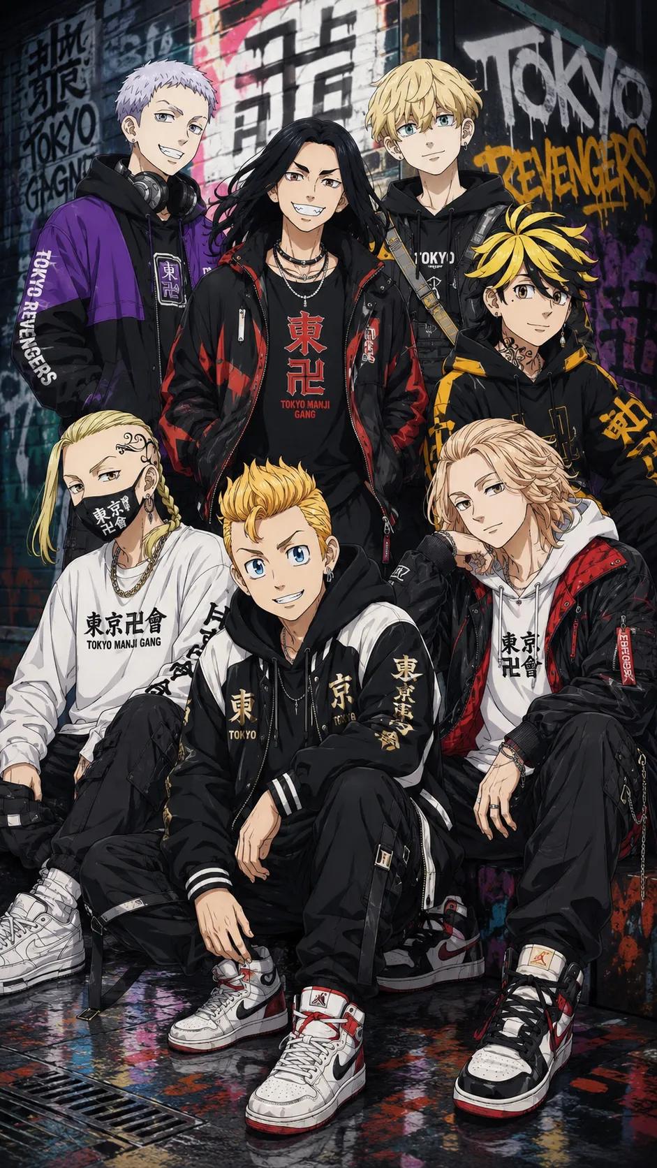
- This case keeps one primary output, so the first image should be treated as the main visual reference.
How The Prompt Is Structured
- The prompt reads as a long, highly specified prompt, which is useful when you want to judge how much specificity this direction needs.
- Its keyword cluster is centered on Neon, Portrait, Cinematic, so you can usually keep that cluster while swapping subject, camera, layout, or copy details.
- A practical rewrite path is: keep the outcome, keep the strongest style cues, then replace only the subject and environment blocks.
Good Follow-up Questions
- What changes first if you keep Neon, Portrait, Cinematic but switch the subject matter?
- Which part of the result comes from section-level structure (Character Design) versus tag-level style cues?
- Which related cases in the same section give you a cleaner or more extreme variation of the same direction?
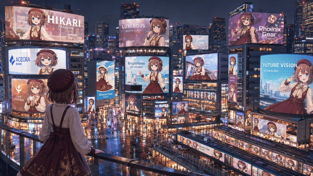
Full Prompt
Create a cinematic wide 16:9 anime-style nighttime cityscape showing a full “advertising takeover” of a futuristic Tokyo-like entertainment district by one idol character, {argument name="character name" default="Hikari"}. View from a high pedestrian balcony in the foreground, looking down over a rainy neon plaza packed with tiny pedestrians, wet reflective streets, glass buildings, trains, skybridges, and dense skyscrapers under a dark blue evening sky. In the foreground, place the same character seen from behind at the railing: a young anime girl with short brown hair, a dark beret, cream blouse, burgundy jumper dress with ribbon bow and subtle gold embroidery, looking out at the city. Fill the city with exactly 18 visible advertisements featuring the same girl in different poses and crops: 1) giant top-left billboard reading “HIKARI / FASHION,” 2) curved mid-left screen reading “AOZORA / BANK,” 3) lower-left orange cafe ad reading “CAFÉ PHOENIX,” 4) slim vertical travel ad reading “WanderSee / TRAVEL,” 5) large central billboard reading “LUMINOUS / BEAUTY CLINIC,” 6) central appliance billboard reading “BrightHome / LIFE APPLIANCE,” 7) small high billboard reading “SKY LEARN,” 8) large upper-right purple gaming ad reading “Phoenix Gear / GAMING,” 9) right-side blue technology billboard reading “FUTURE VISION / TECHNOLOGY,” 10) center-right transit ad reading “HIKARI LINE,” 11) narrow vertical sign reading “Smile / DENTAL,” 12) small vertical character sign beneath the central screens, 13) small character billboard near the lower center intersection, 14) small character sign on a mid-right building corner, 15) long horizontal station-front banner with repeated Hikari portraits, 16) train-side wrap ad labeled “HIKARI LINE,” 17) another train or platform wrap with repeated portraits in the lower-right transit area, and 18) small rooftop or facade screen near the center-right showing her portrait. Make every ad visually consistent but branded differently, with clean white sans-serif English text, glossy LED glow, and no extra unreadable copy. Use rich cyberpunk-commercial lighting, rain reflections, warm shop windows, blue and pink neon, highly detailed architecture, and a grand sense of scale. Some distant character faces on billboards may be softly blurred by glow and distance, but the overall impression must be clear: one beloved character has taken over the entire city’s advertising landscape. Use {argument name="primary outfit color" default="burgundy"}, {argument name="hair color" default="brown"}, {argument name="city mood" default="rainy neon night"}, and {argument name="main brand theme" default="idol fashion and lifestyle"}.