Case Media
Case Notes
This page keeps the media, full prompt, and original source together so you can inspect the result first and decide whether the prompt is worth copying, saving, or comparing.
Case Insights
To make this page easier to search, cite, and reuse later, the case is also broken down into practical guidance about usage, visual cues, and prompt structure.
Best Fit Scenarios
- Use this as a character design benchmark when you need a fast style baseline before rewriting your own prompt.
- It is especially helpful if your target overlaps with Portrait, Fashion, Poster and you want to judge the image result before tuning wording.
- Keep it as a control sample when you compare nearby prompt variants one variable at a time.
Visual Signals To Notice
- The clearest style signals here are Portrait, Fashion, Poster, so those should usually stay in your first rewrite.
- Look at silhouette, costume language, mood styling, and whether the character reads clearly at a glance.
- This case keeps 2 media outputs, which makes it easier to check whether the style remains stable across multiple results.
How The Prompt Is Structured
- The prompt reads as a long, highly specified prompt, which is useful when you want to judge how much specificity this direction needs.
- Its keyword cluster is centered on Portrait, Fashion, Poster, so you can usually keep that cluster while swapping subject, camera, layout, or copy details.
- A practical rewrite path is: keep the outcome, keep the strongest style cues, then replace only the subject and environment blocks.
Good Follow-up Questions
- What changes first if you keep Portrait, Fashion, Poster but switch the subject matter?
- Which part of the result comes from section-level structure (Character Design) versus tag-level style cues?
- Which related cases in the same section give you a cleaner or more extreme variation of the same direction?
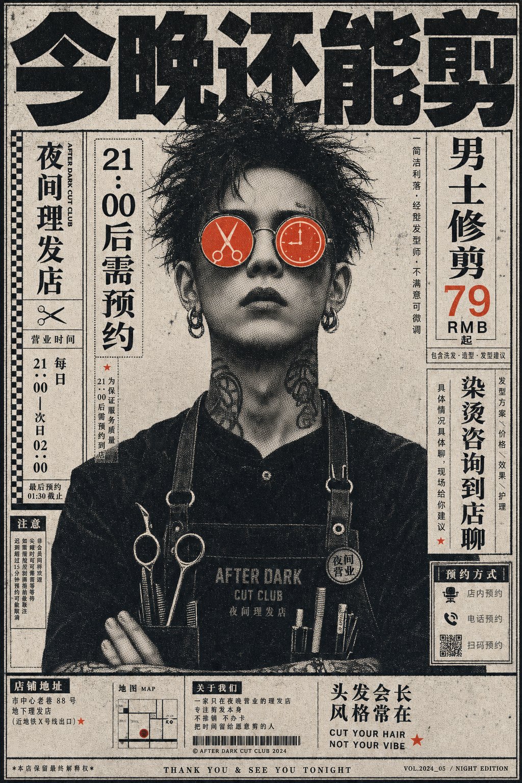
Full Prompt
Generate a retro print-style character poster based on specific theme content: the subject is a front portrait, the face uses coarse halftone dots, newspaper halftones, and photocopy grain processing. The background is filled with vertical small text or narrow-column information, with a huge heavy title at the top pressing against the upper edge. The eyes are covered by two high-saturation circular lenses or markers derived from the theme, with micro graphic symbols hidden inside the circles, becoming the only bright focus of the entire image. The overall structure uses monochromatic value printing as the skeleton, with a small amount of pure accent color fixed in area at the eyes and small decorations. The mood is grotesque, professional, with an underground magazine feel. Text can be mixed vertically and horizontally but must have editorial order, with sidebars, footnotes, and titles interlocking. Do not let the character become a common color portrait; the key is the halftone dots and the high-emotion color eye symbols derived from the theme creating recognition together. —————— New product poster: Independent coffee shop new launch "Orange Peel Cold Brew", vertical 3:4, character is a front portrait of a staff member, eye circles are like two orange peel stickers. Words to appear: Top says "Drink cold today", sidebar says "Orange Peel Cold Brew 26 RMB", "Second cup half price after 2 PM", "Limited this week". Placement: Xiaohongshu cover and bar standee, overall looks like a store announcement in an old magazine.