Case Media
Case Notes
This page keeps the media, full prompt, and original source together so you can inspect the result first and decide whether the prompt is worth copying, saving, or comparing.
Case Insights
To make this page easier to search, cite, and reuse later, the case is also broken down into practical guidance about usage, visual cues, and prompt structure.
Best Fit Scenarios
- Use this as a character design benchmark when you need a fast style baseline before rewriting your own prompt.
- It is especially helpful if your target overlaps with Cinematic, Poster, Character and you want to judge the image result before tuning wording.
- Keep it as a control sample when you compare nearby prompt variants one variable at a time.
Visual Signals To Notice
- The clearest style signals here are Cinematic, Poster, Character, so those should usually stay in your first rewrite.
- Look at silhouette, costume language, mood styling, and whether the character reads clearly at a glance.
- This case keeps one primary output, so the first image should be treated as the main visual reference.
How The Prompt Is Structured
- The prompt reads as a long, highly specified prompt, which is useful when you want to judge how much specificity this direction needs.
- Its keyword cluster is centered on Cinematic, Poster, Character, so you can usually keep that cluster while swapping subject, camera, layout, or copy details.
- A practical rewrite path is: keep the outcome, keep the strongest style cues, then replace only the subject and environment blocks.
Good Follow-up Questions
- What changes first if you keep Cinematic, Poster, Character but switch the subject matter?
- Which part of the result comes from section-level structure (Character Design) versus tag-level style cues?
- Which related cases in the same section give you a cleaner or more extreme variation of the same direction?
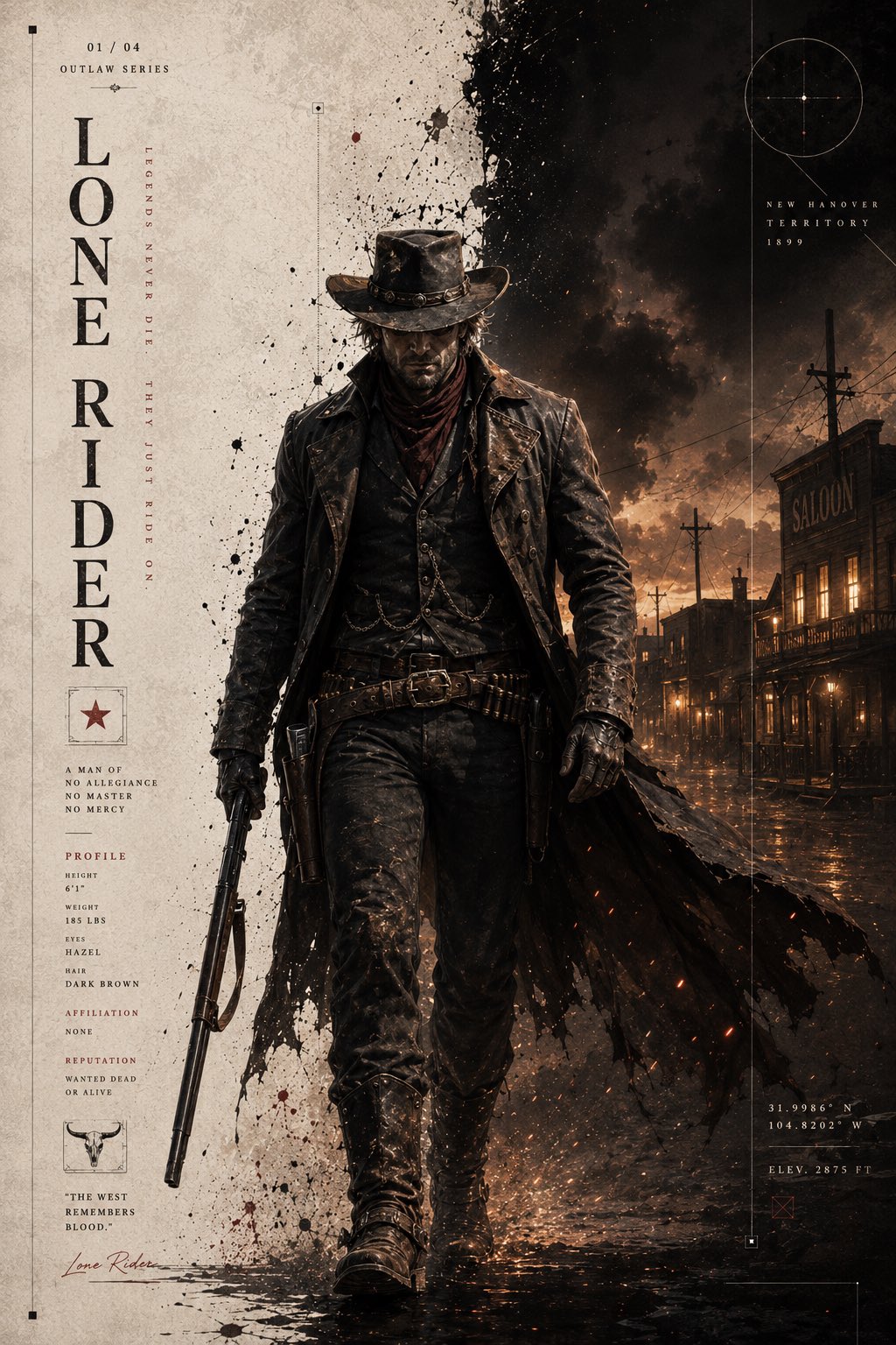
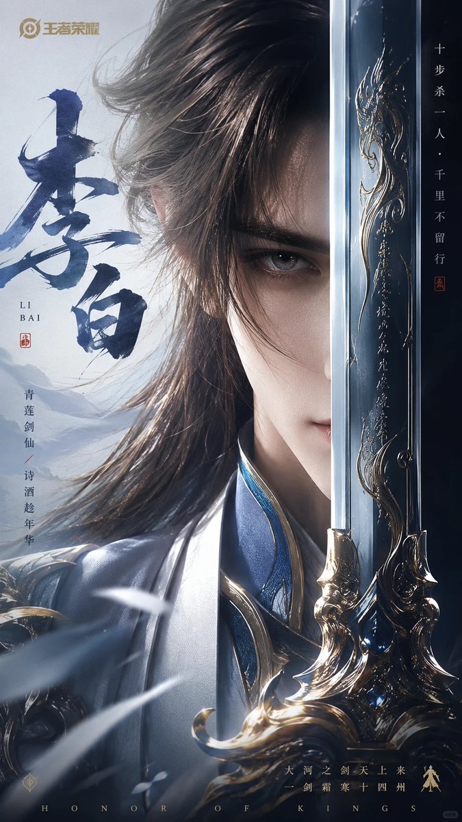
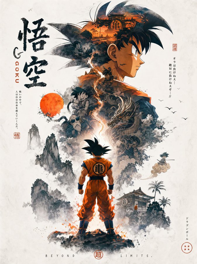
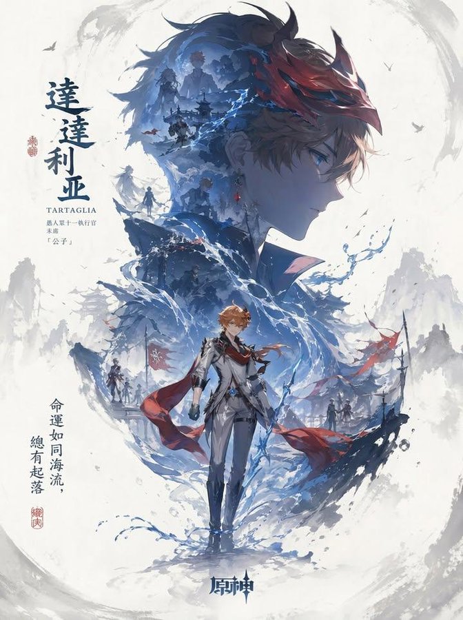
Full Prompt
A character promotional poster of [XXX], using a unified vertical key-visual composition. Each poster follows a hierarchical layout with a larger upper section and smaller lower section: the upper half features the character’s most recognizable head, facial contour, mask, or upper-body silhouette as a massive visual centerpiece, forming a highly identifiable silhouette-style dominant shape. The middle and lower section contains the full character as the secondary focal point, standing in a stable pose or subtle motion, creating the visual core of the composition. Inside the large silhouette and around the character, use double exposure and collage-style narrative composition, blending multiple scenes, symbolic imagery, small character interactions, supporting elements, and environments layered into mist, ink-wash textures, and negative space. Symmetrical or echoing side sub-scenes are placed on the left and right to create narrative tension and spatial variation. A flowing visual line runs vertically through the entire composition, connecting the main character, internal collage, and upper silhouette, enhancing visual unity and guiding the viewer’s eye. The overall image should preserve large areas of negative space, while the edges use ink diffusion, blur, and fragmented fading effects to create the balance of emptiness and solidity found in Eastern aesthetics, with a breathable sense of space. The overall style should remain unified, premium, restrained, and cinematic, emphasizing layering, storytelling, key visual impact, and a cohesive series-poster visual language.