Case Media
Case Notes
This page keeps the media, full prompt, and original source together so you can inspect the result first and decide whether the prompt is worth copying, saving, or comparing.
Case Insights
To make this page easier to search, cite, and reuse later, the case is also broken down into practical guidance about usage, visual cues, and prompt structure.
Best Fit Scenarios
- Use this as a character design benchmark when you need a fast style baseline before rewriting your own prompt.
- It is especially helpful if your target overlaps with Fashion, Poster, Character and you want to judge the image result before tuning wording.
- Keep it as a control sample when you compare nearby prompt variants one variable at a time.
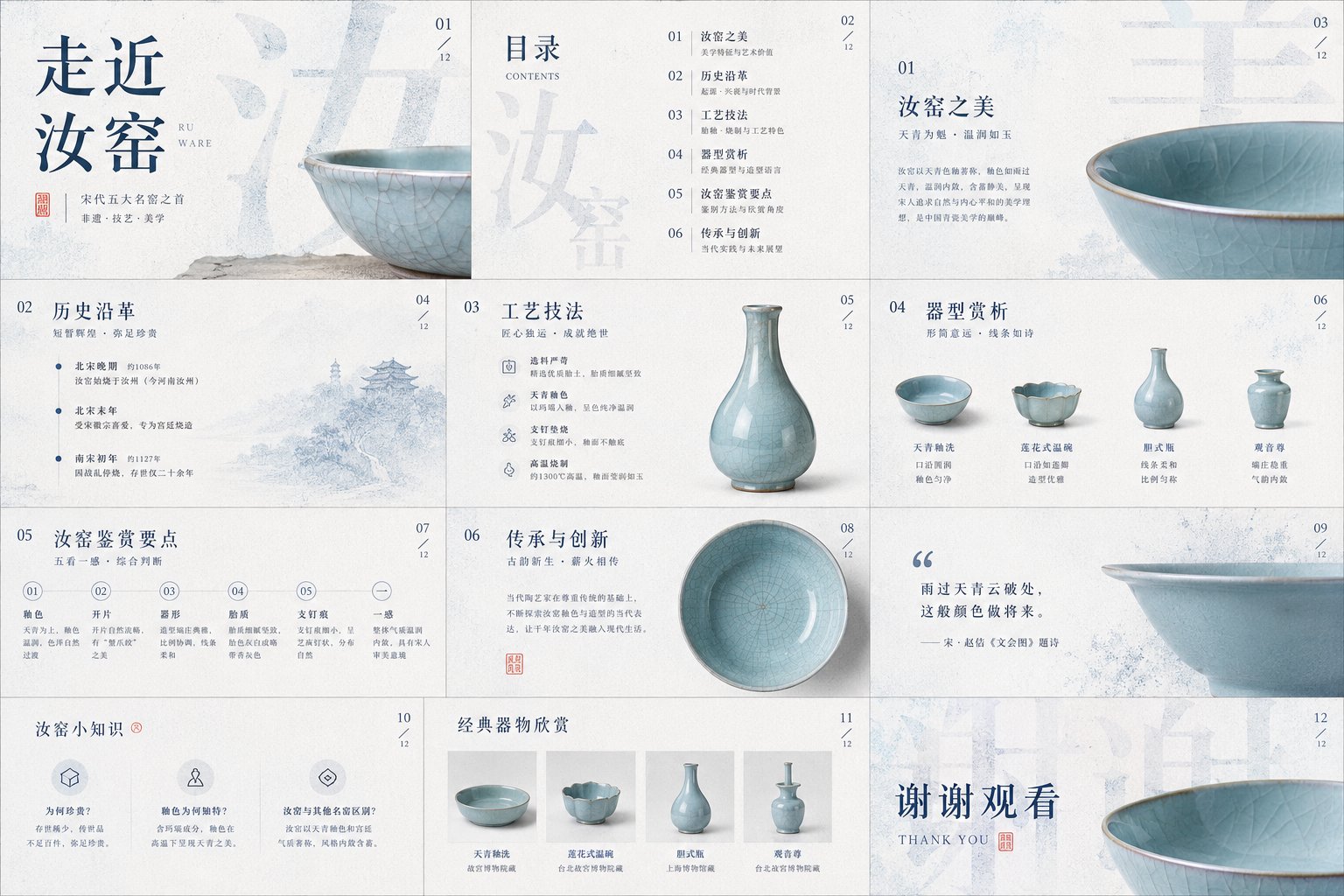
Visual Signals To Notice
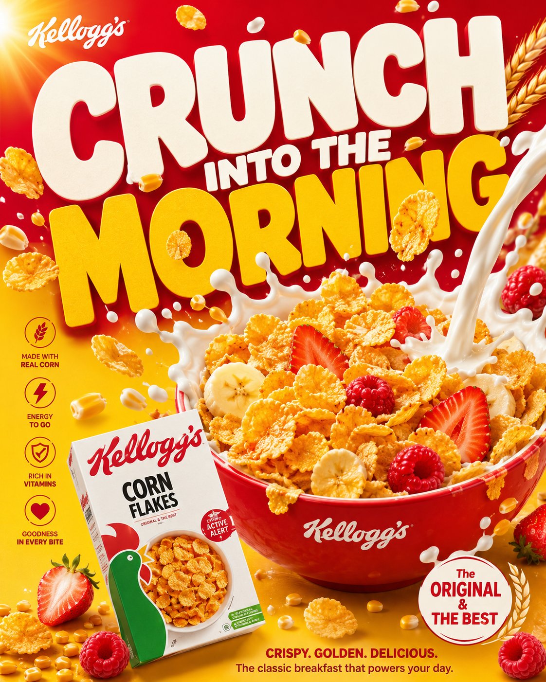
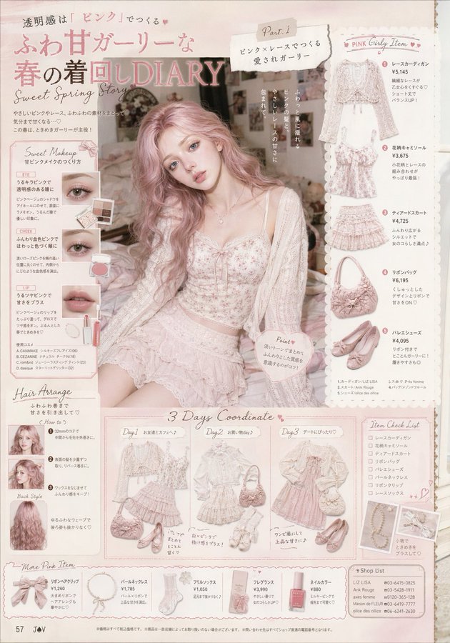
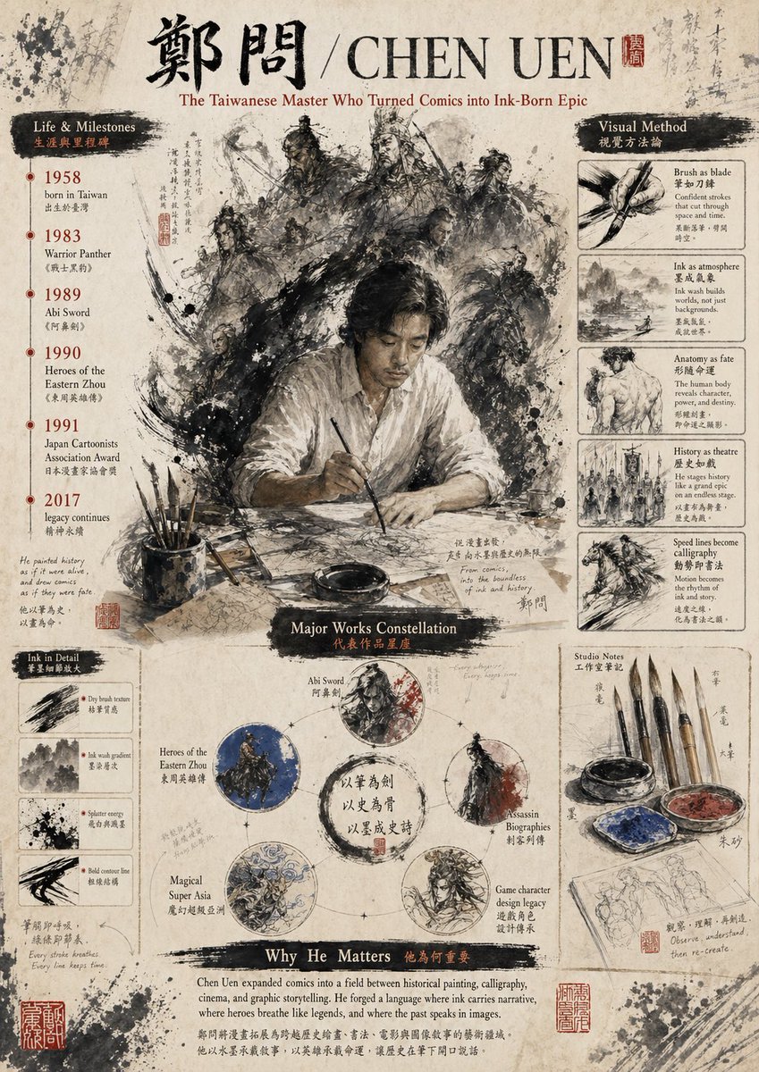
- The clearest style signals here are Fashion, Poster, Character, so those should usually stay in your first rewrite.
- Look at silhouette, costume language, mood styling, and whether the character reads clearly at a glance.
- This case keeps 2 media outputs, which makes it easier to check whether the style remains stable across multiple results.
How The Prompt Is Structured
- The prompt reads as a long, highly specified prompt, which is useful when you want to judge how much specificity this direction needs.
- Its keyword cluster is centered on Fashion, Poster, Character, so you can usually keep that cluster while swapping subject, camera, layout, or copy details.
- A practical rewrite path is: keep the outcome, keep the strongest style cues, then replace only the subject and environment blocks.
Good Follow-up Questions
- What changes first if you keep Fashion, Poster, Character but switch the subject matter?
- Which part of the result comes from section-level structure (Character Design) versus tag-level style cues?
- Which related cases in the same section give you a cleaner or more extreme variation of the same direction?
Full Prompt
Please process the image into a restrained, clean, high-end visual style with a paper-like tactile feel: the background is not blank, but a layer of light-colored material that feels like it has 'breath,' like a quiet backdrop formed by fine paper fibers, soft mist, embossing, or slight grain. Let the main content float out from this background, pursuing not hustle and bustle, but clarity, lightness, and a palpable sense of layers. The image can serve for covers, PPTs, infographics, report pages, product pages, posters, rankings, or data visualizations, but do not be limited by any one type of object; whether the theme is a product, character, space, food, knowledge, business plan, or annual summary, treat the subject's structural order, material edges, shadow depth, and information rhythm as the true visual core. Text should become part of the image structure. Use extra-large scale main titles, keywords, Chinese characters, numbers, or symbols as the background skeleton, letting them occupy large areas of the screen, but turning them into visual pressure through granulation, dot diffusion, slight blurring, translucent occlusion, or edge dissolution, rather than directly stealing the spotlight. Foreground information should remain fine, clean, and readable, like receipts, cards, labels, annotations, numbering, short sentences, or small layout systems, with clear line spacing, hierarchy, and white space. Allow vertical English, narrow-spaced annotations, numbering, small-font explanations, and handwritten-style emphasis to be interspersed, letting text serve the functions of reading, decoration, and navigation simultaneously. Titles can be huge, body text must be restrained, and emphasis should be sparse but accurate, forming a double-layered reading experience where 'it's a graphic from afar, and informative up close.' The color system uses low-saturation light bases as the air and page temperature, with a deep and stable main color to undertake the structure, title, shadows, data center of gravity, or brand memory; this main color can be converted to a more rational, cleaner, warmer, sharper, or softer direction depending on the specific content, but it must maintain the original image's relationship of large-area calmness, small amounts of high-recognition color, and clear light-and-dark order. Accent colors occupy only a small area, used to handle emotional shifts, handwritten marks, key words, numbering, curves, or tiny symbols; they should change semantics according to the theme, for example, more decisive for business content, calmer for academic content, warmer for festive content, cleaner for medical content, lighter for children's content, but do not dye the entire screen with color. Dark colors are responsible for structure and weight, light colors for breathing, warm or different colors for momentary attention, and shadows, transparent wireframes, paper-edge highlights, and grain textures for depth. The layout must have a clear foreground and background relationship: in the background, there are huge, softened glyphs or information blocks, like a wall made of text; the mid-ground can have transparent ovals, fine lines, semi-transparent boundaries, or slight halos to create a framed field of attention; the foreground places the most important subject or information module, allowing it to form a real sense of space by being slightly tilted, stacked, bent, misaligned, or suspended. Do not make a standard centered template; the image's center of gravity can be skewed to the right, to the bottom, or pushed out by large characters, keeping a quiet vertical information band on the left or edge. White space must be controlled; where it is dense, it should feel like compressed paper pages or data layers; where it is sparse, it should feel like air; maintain precise distance between all elements, achieving both the completeness of a commercial poster and the calmness of editorial design. In the specific task below, let the image naturally grow into the form it needs: based on the theme, text, data, brand, product, or material I provide, generate a visual work with a blue-and-white granular text background, light foreground layers, a small amount of content-responsive accent colors, delicate paper feel, and high-end information order. Theme: Approaching Ru Ware. Use: ppt, courseware.