Case Media
Case Notes
This page keeps the media, full prompt, and original source together so you can inspect the result first and decide whether the prompt is worth copying, saving, or comparing.
Case Insights
To make this page easier to search, cite, and reuse later, the case is also broken down into practical guidance about usage, visual cues, and prompt structure.
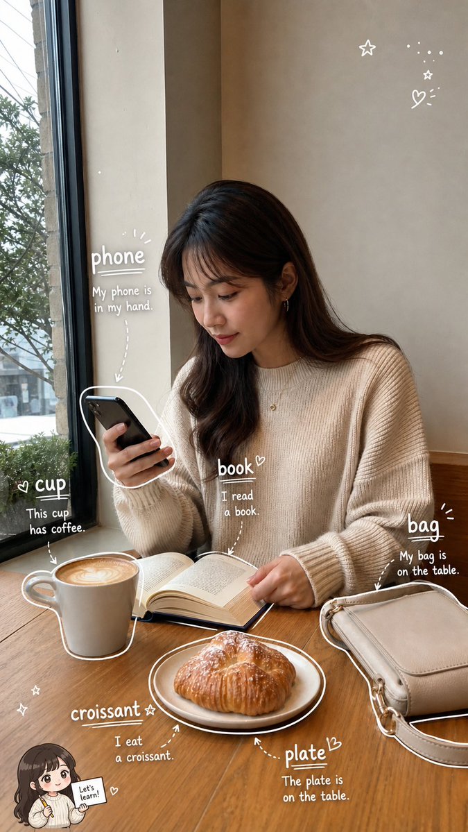
Best Fit Scenarios
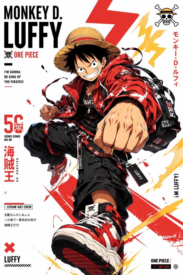
- Use this as a character design benchmark when you need a fast style baseline before rewriting your own prompt.
- It is especially helpful if your target overlaps with Poster, Illustration, Character and you want to judge the image result before tuning wording.
- Keep it as a control sample when you compare nearby prompt variants one variable at a time.
Visual Signals To Notice
- The clearest style signals here are Poster, Illustration, Character, so those should usually stay in your first rewrite.
- Look at silhouette, costume language, mood styling, and whether the character reads clearly at a glance.
- This case keeps one primary output, so the first image should be treated as the main visual reference.
How The Prompt Is Structured
- The prompt reads as a long, highly specified prompt, which is useful when you want to judge how much specificity this direction needs.
- Its keyword cluster is centered on Poster, Illustration, Character, so you can usually keep that cluster while swapping subject, camera, layout, or copy details.
- A practical rewrite path is: keep the outcome, keep the strongest style cues, then replace only the subject and environment blocks.
Good Follow-up Questions
- What changes first if you keep Poster, Illustration, Character but switch the subject matter?
- Which part of the result comes from section-level structure (Character Design) versus tag-level style cues?
- Which related cases in the same section give you a cleaner or more extreme variation of the same direction?
Full Prompt
请根据用户上传的生活照片(Image A),创作一张高完成度的「看图学单词手账照 / Photo Vocabulary Scrapbook」。 【核心任务】 基于用户上传的真实生活照片,在尽量保留原图真实感与主体内容的基础上,把这张照片增强成一张“轻学习手账风”的英语单词学习图。 请自动识别照片中清晰、常见、适合英语初学者学习的日常物品,并用白色细线手绘风格圈出物品,再为每个物品添加英文单词和简短英文例句,让整张图看起来像一页清爽、自然、适合社交媒体发布的 photo vocabulary scrapbook。 【原图保留要求】 Image A 是用户上传的原始照片,也是本次创作的基础底图。 请尽量保留原图中的: - 真实人物(如果有) - 场景环境 - 物体摆放关系 - 光线氛围 - 构图结构 - 照片原本的生活感与真实摄影感 不要大幅改动原图,不要把照片整体变成插画,不要破坏照片的真实感。 如果照片中有人物,不要换脸,不要明显改变人物身份与姿态。 【物品识别规则】 请优先识别 6 个日常生活中常见、清晰可见、适合英语学习的物品。 如果画面中合适物品不足,或者画面空间不足以清晰呈现 6 个标注,则可降为 5 个。 不要为了凑数而选择太小、太模糊、太抽象或不常见的物品。 优先选择: - 日常高频物品 - 容易理解和学习的名词 - 视觉上清晰可辨认的物品 【标注呈现方式】 请用白色细线手绘风格对每个被识别的物品进行标注。 要求如下: - 用白色细线沿着物体边缘轻轻描出轮廓 - 线条要像随手画上去的一笔画,轻松自然,不要太工整 - 可加入少量箭头、虚线、圈线或辅助指向线 - 标注风格要自然、有留白、像手账笔记 - 不要把整张图画满,不要过度装饰 - 标注应尽量分布均衡,形成自然阅读路径 【文字内容格式】 每个物品旁边只写两部分内容: 1. 英文单词(最突出、字号最大) 2. 一句简短英文例句(比单词小一号) 不要写中文,不要写复杂英文释义,不要写太长的解释段落。 整体以“纯英文轻学习标注”为主。 句子要求: - 简短 - 自然 - 容易理解 - 适合英语初学者 - 难度控制在 A1–A2 - 尽量使用基础词汇和基础句型 - 每句尽量短,建议 4–8 个英文单词左右 - 不要写复杂从句,不要使用生僻词 【文字排版要求】 - 英文单词最突出 - 例句略小一号 - 文字整体清晰可读 - 不要让文字块过大 - 文字颜色以白色为主 - 如有需要,可加极轻微描边或阴影,保证在照片背景上清晰可读 - 保持手写笔记感,不要像正式排版海报 【Chibi 学习助手规则】 可选加入 1 个很小的 chibi 学习助手,但必须遵循以下规则: 1. 如果照片中有清晰可见的人物: 可以加入 1 个小型 chibi 学习助手。 该助手应基于照片中的主要人物形象延展而来,保留人物的基本发型、服装特征或整体气质,像一个迷你英语学习小助手。 2. 如果照片中没有人物,但有清晰可见的动物或宠物: 也可以加入 1 个很小的动物学习助手。 该助手应基于该动物形象进行可爱化处理,并与原动物保持一定对应关系。 3. 如果照片中既没有人物,也没有动物: 不要加入任何 chibi 学习助手。 4. chibi 学习助手只能有 1 个,而且必须很小: - 放在角落或边缘区域 - 不能成为主视觉 - 不能遮挡主体物品、英文单词或例句 - 只能作为轻微辅助装饰 5. chibi 学习助手的动作可以是: - 拿着单词卡 - 拿着铅笔 - 拿着小本子 - 轻轻指向某个单词 - 做出学习、提醒、陪伴的可爱动作 【手绘辅助元素】 可以在画面空白处加入少量辅助性的手绘装饰元素,用于增强 scrapbook / 手账学习感,例如: - stars - sparkles - arrows - circles - underlines - dotted lines - tiny hearts - cute little icons 要求: - 数量少 - 点到为止 - 以白色为主 - 不要太花 - 不要喧宾夺主 - 不能影响物品学习标注的清晰度 【整体构图要求】 整体视觉应以“原始生活照片 + 物品学习标注”为主。 构图逻辑如下: - 保持原图主体清晰 - 6 个(或 5 个)英语单词标注分散在画面中 - 白色手绘线把物品与文字自然连接起来 - 标注布局均衡,不要都挤在一个区域 - 优先避开人物脸部和主体核心区域 - 让观众的阅读顺序自然形成: 先看照片 → 再看被圈出的物品 → 再读单词 → 再读例句 【整体风格关键词】 realistic lifestyle photo, photo vocabulary scrapbook, white hand-drawn annotations, English vocabulary notes, clean and natural layout, light learning content, soft doodle style, social-media-friendly, minimal scrapbook aesthetic, casual study notes, cute but clear. 【避免事项】 请避免以下问题: - 标注数量过多 - 物品选择不典型 - 文字太长 - 例句太复杂 - 手绘线条太乱 - 元素堆得太满 - 遮挡主体 - 把照片改得不像真实照片 - chibi 助手太大或太抢眼 - 没有人物/动物却硬加 chibi - 文字乱码 - 英文错误或不自然 - 排版拥挤难读 【最终目标总结】 把一张普通生活照,变成一页: “可爱、清爽、自然的英文单词学习手账图”。