Case Media
Case Notes
This page keeps the media, full prompt, and original source together so you can inspect the result first and decide whether the prompt is worth copying, saving, or comparing.
Case Insights
To make this page easier to search, cite, and reuse later, the case is also broken down into practical guidance about usage, visual cues, and prompt structure.
Best Fit Scenarios
- Use this as a character design benchmark when you need a fast style baseline before rewriting your own prompt.
- It is especially helpful if your target overlaps with Poster, Illustration, Screenshot and you want to judge the image result before tuning wording.
- Keep it as a control sample when you compare nearby prompt variants one variable at a time.
Visual Signals To Notice
- The clearest style signals here are Poster, Illustration, Screenshot, so those should usually stay in your first rewrite.
- Look at silhouette, costume language, mood styling, and whether the character reads clearly at a glance.
- This case keeps one primary output, so the first image should be treated as the main visual reference.
How The Prompt Is Structured
- The prompt reads as a long, highly specified prompt, which is useful when you want to judge how much specificity this direction needs.
- Its keyword cluster is centered on Poster, Illustration, Screenshot, so you can usually keep that cluster while swapping subject, camera, layout, or copy details.
- A practical rewrite path is: keep the outcome, keep the strongest style cues, then replace only the subject and environment blocks.
Good Follow-up Questions
- What changes first if you keep Poster, Illustration, Screenshot but switch the subject matter?
- Which part of the result comes from section-level structure (Character Design) versus tag-level style cues?
- Which related cases in the same section give you a cleaner or more extreme variation of the same direction?
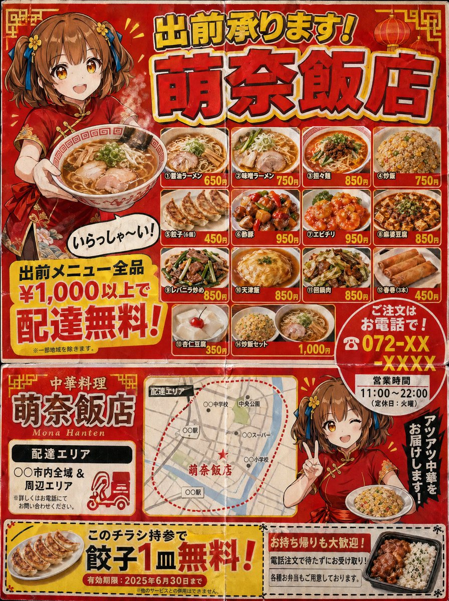
Full Prompt
A Japanese neighborhood Chinese restaurant delivery flyer for mailbox posting (3:4 aspect ratio). Designed to look like a double-sided B5 print. Flyer characteristics (following the grammar of real delivery flyers): - Flashy red and yellow color scheme. - Large text at the top: "Delivery Available! {argument name="shop name" default="Mona-Hanten"}" (shadowed Gothic font). - An illustration of a {argument name="character" default="Chinese girl in a red cheongsam with a brown short bob"} holding ramen and saying "Welcome!" in a speech bubble. - A menu photo grid (4x3) featuring various dishes: different types of ramen, fried rice, gyoza, sweet and sour pork, shrimp in chili sauce, mapo tofu, liver and leek stir-fry, tenshinhan, twice-cooked pork, spring rolls, annin tofu, and fried rice sets. - Names and prices for each dish. - A large yellow banner saying "Free delivery on all menu items over ¥1,000!". - "Order by phone! ☎ 072-XX-XXXX" emphasized with a red circle. - Business hours "11:00-22:00 (Closed on Tuesdays)". - Delivery area map (simple schematic map). - Coupon (perforated line for clipping): "One free plate of gyoza with this flyer!". Texture of cheap paper printing. Includes fold marks. Precision that could be mistaken for a real Japanese delivery flyer.