Case Media
Case Notes
This page keeps the media, full prompt, and original source together so you can inspect the result first and decide whether the prompt is worth copying, saving, or comparing.
Case Insights
To make this page easier to search, cite, and reuse later, the case is also broken down into practical guidance about usage, visual cues, and prompt structure.
Best Fit Scenarios
- Use this as a character design benchmark when you need a fast style baseline before rewriting your own prompt.
- It is especially helpful if your target overlaps with Portrait, Illustration, Character and you want to judge the image result before tuning wording.
- Keep it as a control sample when you compare nearby prompt variants one variable at a time.
Visual Signals To Notice
- The clearest style signals here are Portrait, Illustration, Character, so those should usually stay in your first rewrite.
- Look at silhouette, costume language, mood styling, and whether the character reads clearly at a glance.
- This case keeps 2 media outputs, which makes it easier to check whether the style remains stable across multiple results.
How The Prompt Is Structured
- The prompt reads as a long, highly specified prompt, which is useful when you want to judge how much specificity this direction needs.
- Its keyword cluster is centered on Portrait, Illustration, Character, so you can usually keep that cluster while swapping subject, camera, layout, or copy details.
- A practical rewrite path is: keep the outcome, keep the strongest style cues, then replace only the subject and environment blocks.
Good Follow-up Questions
- What changes first if you keep Portrait, Illustration, Character but switch the subject matter?
- Which part of the result comes from section-level structure (Character Design) versus tag-level style cues?
- Which related cases in the same section give you a cleaner or more extreme variation of the same direction?
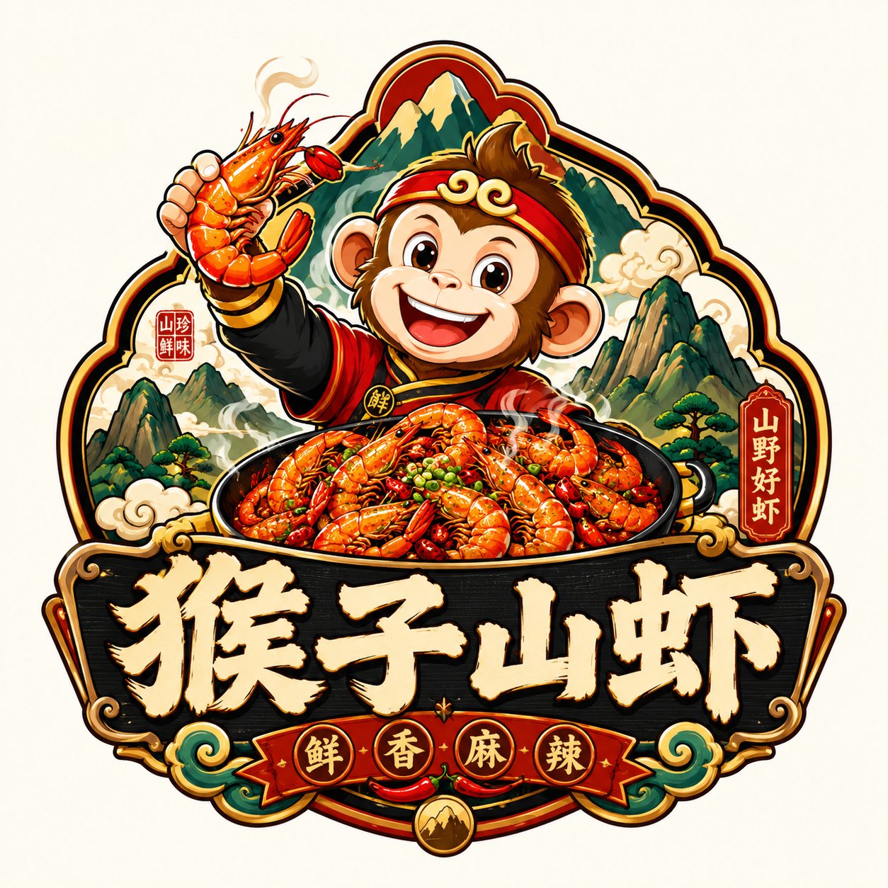
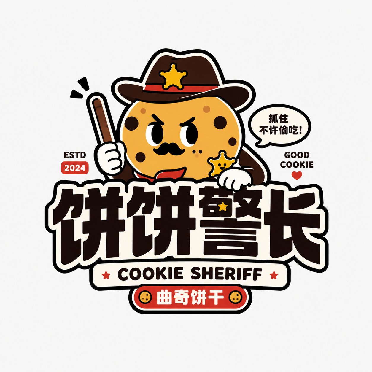
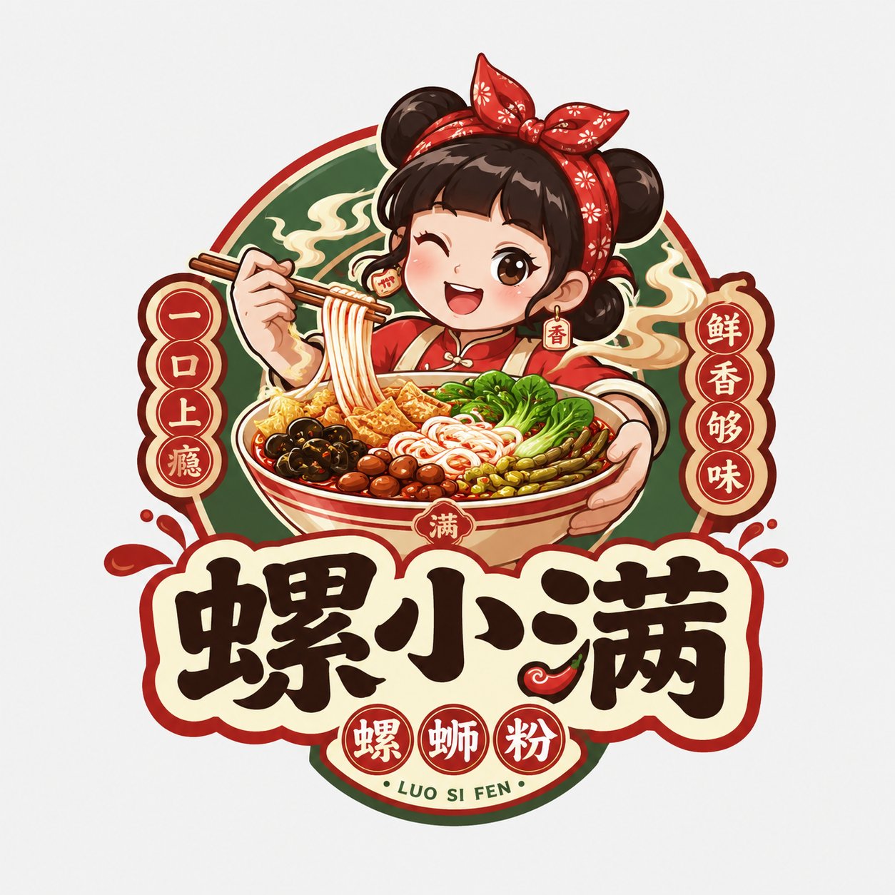
Full Prompt
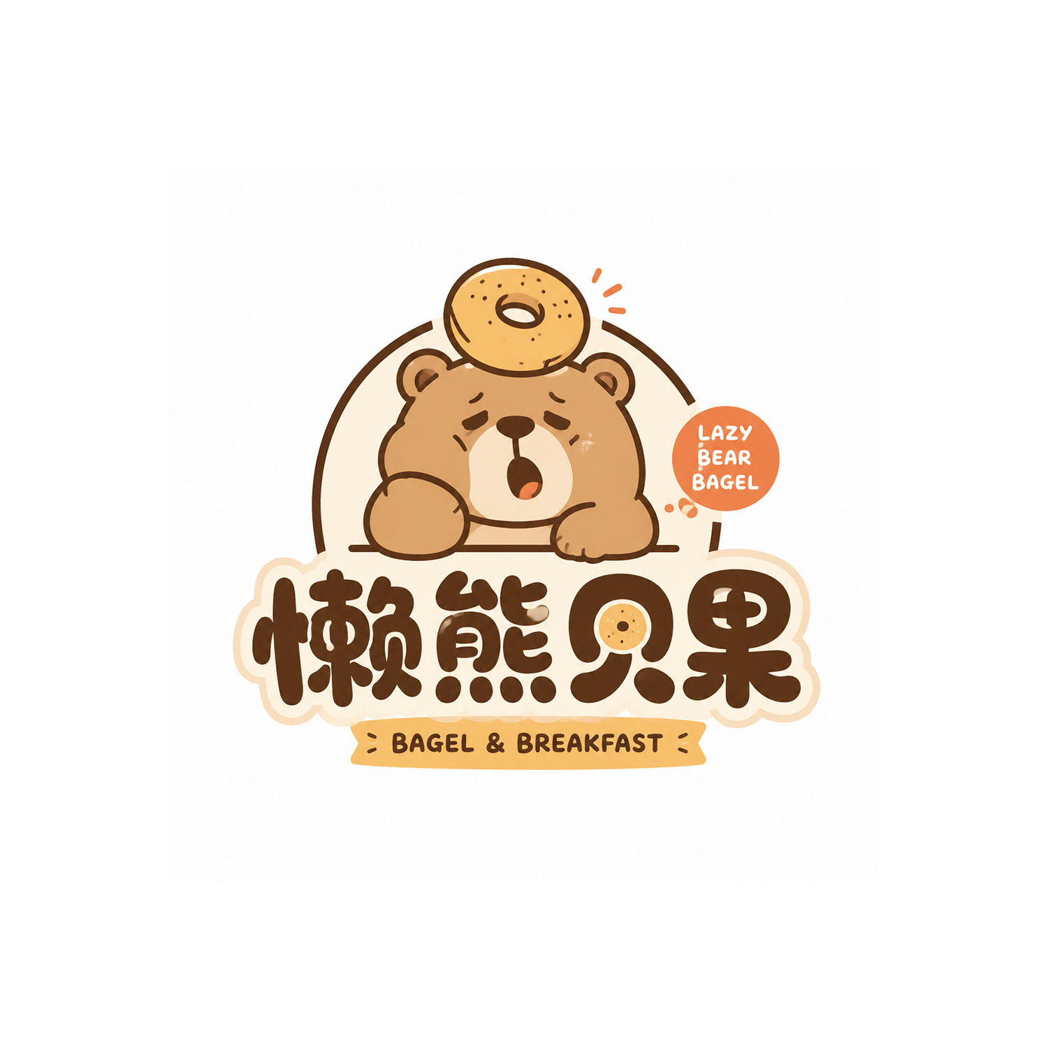
Please generate an original 《Playful Mascot Wordmark Logo》. Brand name: {{Brand Name}} Subtitle / Category: {{Subtitle / Category}} Brand type: {{Dessert Shop / Coffee Shop / Bagel Shop / Sparkling Water / Pet Brand / Trendy Toy Store / Bakery / Lifestyle Brand, etc.}} Core character: {{Animal / Fruit / Food / Monster / Personified Character}} Character personality: {{Lazy / Cool / Adorable / Weirdly Cute / Mischievous / Tsundere / Happy / Speechless}} Main color: {{Main Color}} Secondary color: {{Secondary Color}} Aspect ratio: 1:1 The overall style is 《Playful Mascot Wordmark Logo》. This is not a common cartoon illustration, nor is it a children's sticker, but a character-based Logo with a sense of brand, IP, and commercial usability. Design requirements: 1. The character must have a clear expression and personality, not just a common animal icon. 2. The character's shape should be simple, rounded, exaggerated, and memorable, suitable for brand avatars, stickers, packaging, and store signs. 3. A small action or small prop can be added, such as holding coffee, carrying a bagel on the head, blowing bubbles, hugging a dessert, holding a straw, dozing off, waving, resting chin on hands, sneaking a bite, etc. 4. The graphics should be flat, clean, with clear outlines, not realistic, no complex shadows, no 3D. 5. The brand name must be clearly readable, and the wordmark should have a sense of design, not like ordinary system fonts. 6. The font can be rounded, bold, handwritten, trendy, or light retro, and must be unified with the character's personality. 7. A small amount of auxiliary elements such as English, Chinese, Japanese small text, year, dots, curved text, registration symbols, etc., can be added, but should be restrained. 8. Use 2–4 colors for the color scheme, bright but not cluttered. 9. Keep the background pure white or light-colored, with the Logo centered and in moderate proportion. 10. The overall look should be like a real, usable small shop brand Logo, rather than just simple illustration material. Avoid: No common children's cartoons, no cheap sticker feel, no complex scenes, no 3D, no gradients, no realistic animals, no over-the-top cuteness, no fonts just typed out casually, no separation of graphics and text, no overly messy colors. Final effect: An original playful mascot wordmark logo with expression, personality, and a small shop brand feel.