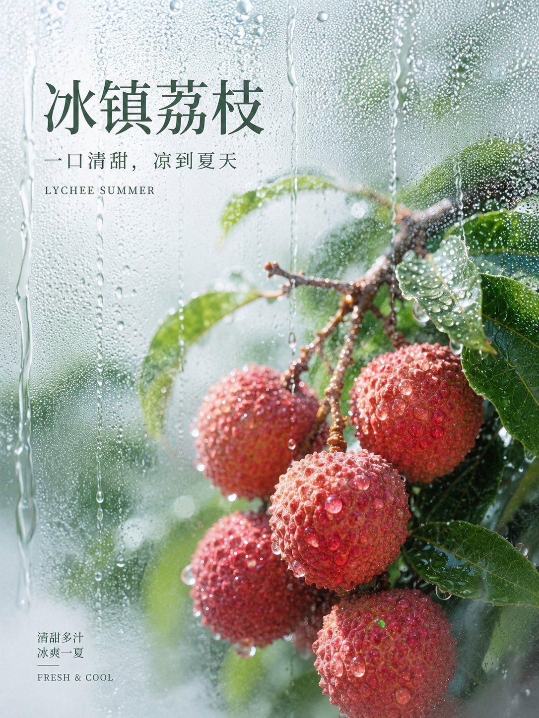
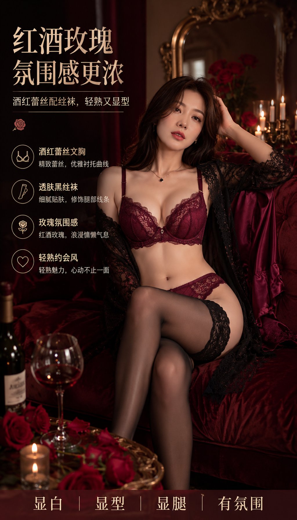
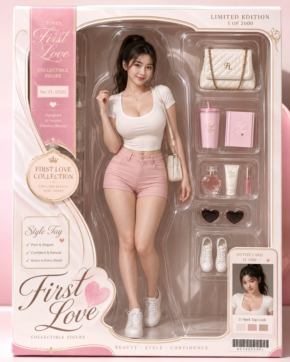
Case Media

Case Notes
This page keeps the media, full prompt, and original source together so you can inspect the result first and decide whether the prompt is worth copying, saving, or comparing.
Case Insights
To make this page easier to search, cite, and reuse later, the case is also broken down into practical guidance about usage, visual cues, and prompt structure.
Best Fit Scenarios
- Use this as a character design benchmark when you need a fast style baseline before rewriting your own prompt.
- It is especially helpful if your target overlaps with Poster, Character, Typography and you want to judge the image result before tuning wording.
- Keep it as a control sample when you compare nearby prompt variants one variable at a time.
Visual Signals To Notice
- The clearest style signals here are Poster, Character, Typography, so those should usually stay in your first rewrite.
- Look at silhouette, costume language, mood styling, and whether the character reads clearly at a glance.
- This case keeps 2 media outputs, which makes it easier to check whether the style remains stable across multiple results.
How The Prompt Is Structured
- The prompt reads as a long, highly specified prompt, which is useful when you want to judge how much specificity this direction needs.
- Its keyword cluster is centered on Poster, Character, Typography, so you can usually keep that cluster while swapping subject, camera, layout, or copy details.
- A practical rewrite path is: keep the outcome, keep the strongest style cues, then replace only the subject and environment blocks.
Good Follow-up Questions
- What changes first if you keep Poster, Character, Typography but switch the subject matter?
- Which part of the result comes from section-level structure (Character Design) versus tag-level style cues?
- Which related cases in the same section give you a cleaner or more extreme variation of the same direction?
Full Prompt
Brand Name: [Brand Name] English Name: [English Name] Industry: [Fragrance / Skincare / Med-beauty / Tea / Pets / Home / Packaging / AI Technology] Exhibition Name: [Exhibition Name] Booth Number: [Booth Number] Date: [Date] Location: [Pavilion Location] Invitation Language: [Short Invitation Language] Closing Copy: [Brand-style Short Phrase] Main Color: [Main Color] Auxiliary Color: [Auxiliary Color] Accent Color: [Accent Color] Generate a vertical 9:16 high-end brand exhibition invitation poster, with the theme of [Brand Name] participating in [Exhibition Name]. Image Type: High-end brand exhibition invitation × 3D booth main visual poster. The overall look should be like a participation main visual released by a high-end brand, not an ordinary investment promotion poster or a cheap exhibition flyer. Overall Style: High-end, atmospheric, clean, restrained, with brand character, sufficient white space, clear information, and unified visuals. The image should have the ceremonial sense of a formal invitation and the commercial texture of a brand space proposal. Layout Structure: Top: Place brand Logo / brand name / English name, simple and high-end; Middle-top: Large title "INVITATION / 邀请函", paired with the exhibition name, year, and a short invitation language; Middle-bottom: A complete 3D brand booth rendering as the core main visual of the image; Bottom: Retain only the booth number, date, location, and a brand-style closing copy. No QR codes, no stacking of contact information, no excessive small text. 3D Booth Design: The booth adopts a realistic, buildable professional exhibition space design with a 45-degree three-dimensional perspective, complete structure, coordinated proportions, and clear spatial layering. The booth includes the brand storefront, luminous light strips, reception desk, product display wall, display cabinets, main product installations, poster lightboxes, negotiation area, local greenery, or industry-related high-end furnishings. The booth storefront clearly displays [Brand Name] and [Booth Number]. The booth design should look like a real brand exhibition rendering, clean, exquisite, professional, with a high-end commercial rendering texture. Color System: Centered on [Main Color], paired with [Auxiliary Color] and a small amount of [Accent Color]. The brand's main color needs to run through the titles, information labels, booth storefront, product packaging, light strips, and spatial details. The overall colors should be low-saturation, unified, and durable, not flashy, and without a promotional feel. Background Design: The background maintains a large area of white space; soft gradients, slight paper textures, an air atomization feel, abstract brand curves, or light industry atmosphere elements can be used. The background must not compete with the subject, must not be cluttered, and must not look like an event flyer. Fonts and Typography: Clear font hierarchy, atmospheric titles, prominent booth numbers, and easy-to-read date and location. Chinese fonts can be modern Songti, high-end Heiti, or brand-specific fonts; English can use elegant serif or modern sans-serif. The overall layout should have a sense of breathing, order, and high-end invitation texture. Lighting and Materials: The booth uses soft and bright spatial lighting with realistic materials, including acrylic, metal, glass, lacquer, wood veneer, frosted surfaces, and the light-emitting texture of light strips. The floor can have slight reflections; the overall look is transparent, exquisite, and modern, with a realistic commercial rendering texture. Quality Requirements: High-definition, exquisite, professional, realistic, high brand integrity, reasonable spatial structure, clear product display, distinct information hierarchy, suitable for brand exhibition pre-heating, exhibition invitations, and social media distribution. Avoid: No QR codes, no cheap investment promotion style, no promotional poster feel, no excessive small text, no cluttered backgrounds, no booth deformation, no perspective errors, no garbled text, no low resolution, no information overload.