Case Media
Case Notes
This page keeps the media, full prompt, and original source together so you can inspect the result first and decide whether the prompt is worth copying, saving, or comparing.
Case Insights
To make this page easier to search, cite, and reuse later, the case is also broken down into practical guidance about usage, visual cues, and prompt structure.
Best Fit Scenarios
- Use this as a character design benchmark when you need a fast style baseline before rewriting your own prompt.
- It is especially helpful if your target overlaps with Cinematic, Poster, Illustration and you want to judge the image result before tuning wording.
- Keep it as a control sample when you compare nearby prompt variants one variable at a time.
Visual Signals To Notice
- The clearest style signals here are Cinematic, Poster, Illustration, so those should usually stay in your first rewrite.
- Look at silhouette, costume language, mood styling, and whether the character reads clearly at a glance.
- This case keeps one primary output, so the first image should be treated as the main visual reference.
How The Prompt Is Structured
- The prompt reads as a long, highly specified prompt, which is useful when you want to judge how much specificity this direction needs.
- Its keyword cluster is centered on Cinematic, Poster, Illustration, so you can usually keep that cluster while swapping subject, camera, layout, or copy details.
- A practical rewrite path is: keep the outcome, keep the strongest style cues, then replace only the subject and environment blocks.
Good Follow-up Questions
- What changes first if you keep Cinematic, Poster, Illustration but switch the subject matter?
- Which part of the result comes from section-level structure (Character Design) versus tag-level style cues?
- Which related cases in the same section give you a cleaner or more extreme variation of the same direction?
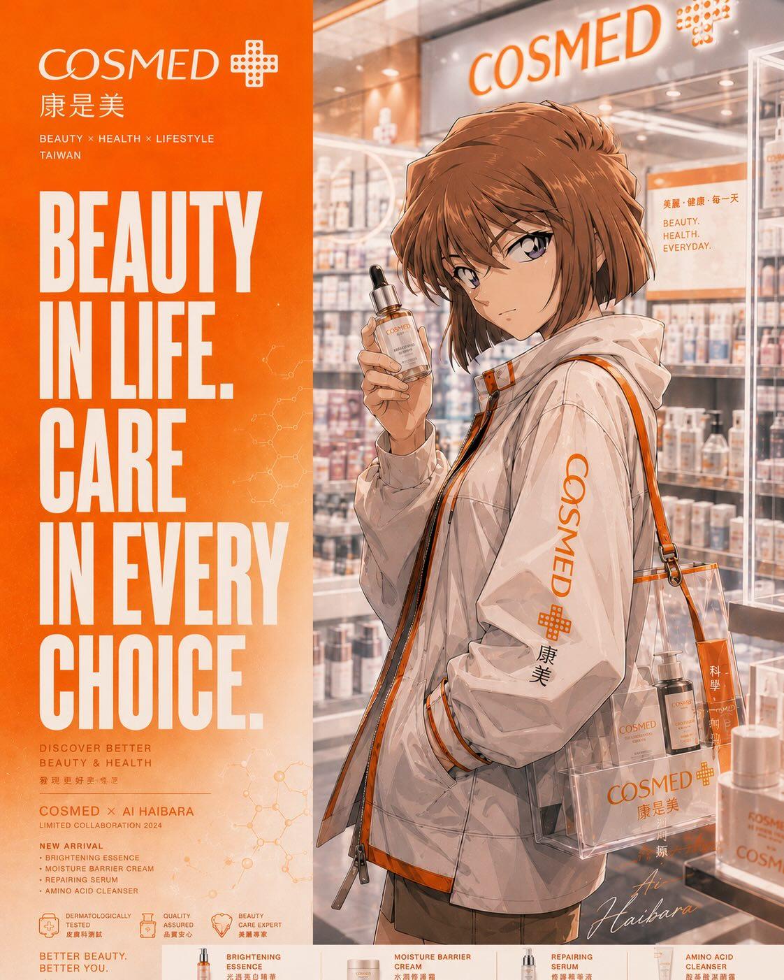
Full Prompt
Create a premium anime-style commercial poster inspired by a real Taiwanese COSMED beauty store collaboration campaign. Vertical layout with a strong split composition: bold typography panel on the left and cinematic anime character scene on the right. Feature a stylish anime girl with short brown hair and expressive eyes wearing a white COSMED-branded windbreaker jacket with orange accents, holding a skincare serum bottle inside a modern beauty store filled with cosmetics and glowing shelves. Include transparent shopping bag with beauty products, realistic packaging details, soft cinematic lighting, glossy reflections, luxury skincare advertising aesthetic, warm orange and cream color palette, highly detailed anime rendering, Makoto Shinkai + modern commercial anime style, ultra-clean typography, realistic folds and textures, lifestyle branding atmosphere, elegant Japanese/Taiwanese retail design, depth of field, premium magazine advertisement look. Large bold text on left side: “BEAUTY IN LIFE. CARE IN EVERY CHOICE.” Include subtle molecular graphics and beauty icons. Ultra detailed, 8K, cinematic anime illustration, poster design, professional advertising composition, high-end retail campaign aesthetic --ar 2:3