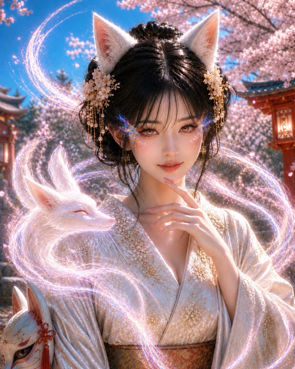
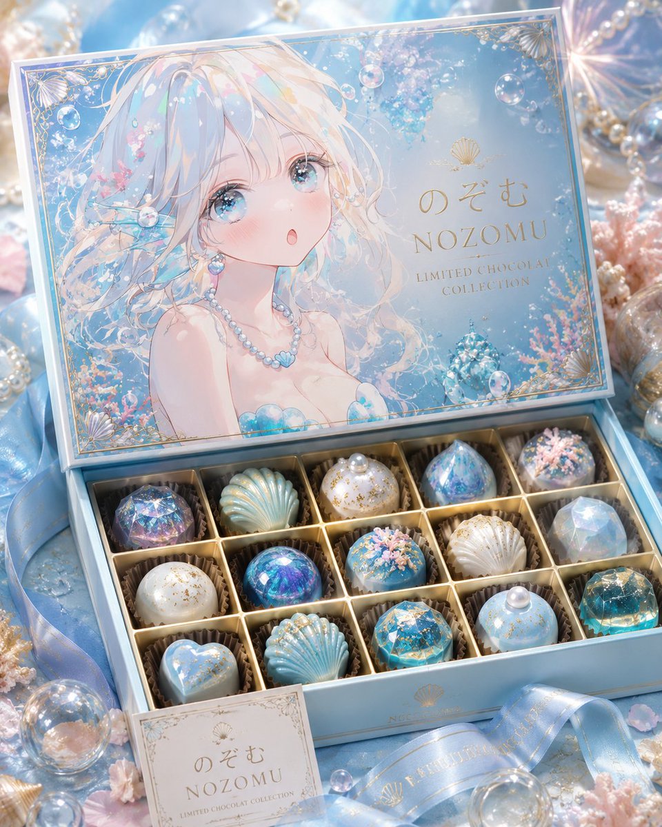
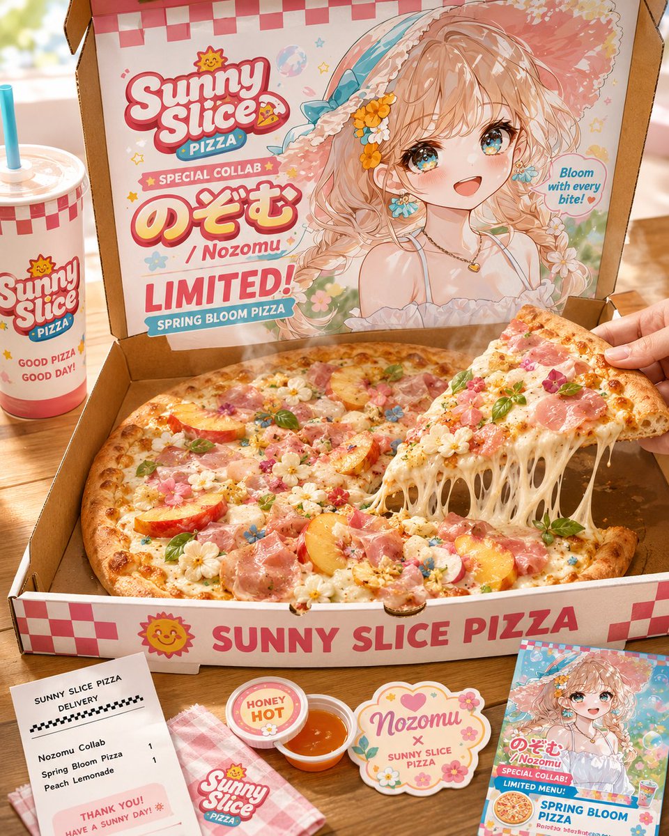
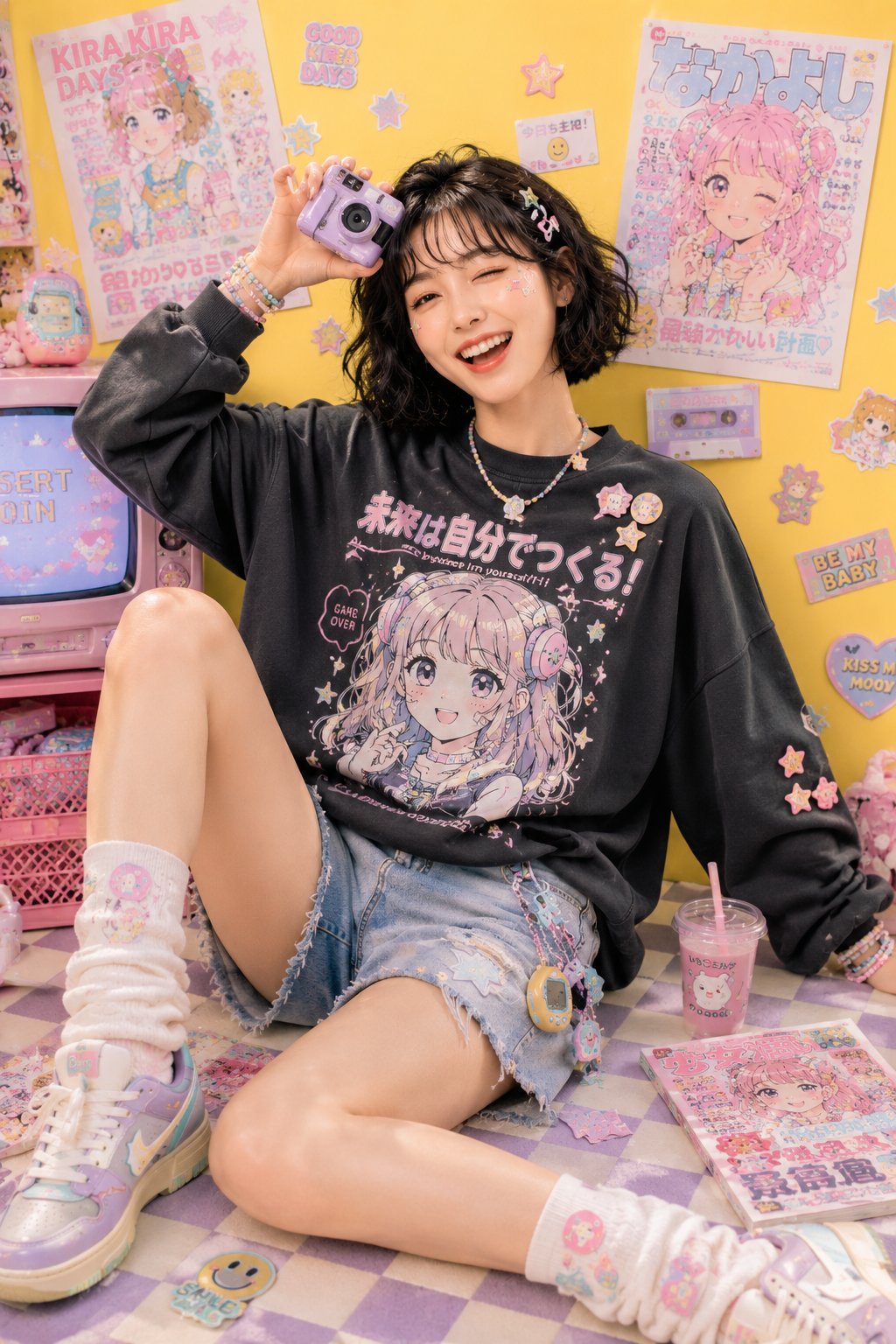
Case Media
Case Notes
This page keeps the media, full prompt, and original source together so you can inspect the result first and decide whether the prompt is worth copying, saving, or comparing.
Case Insights
To make this page easier to search, cite, and reuse later, the case is also broken down into practical guidance about usage, visual cues, and prompt structure.
Best Fit Scenarios
- Use this as a character design benchmark when you need a fast style baseline before rewriting your own prompt.
- It is especially helpful if your target overlaps with Character, Anime, Product and you want to judge the image result before tuning wording.
- Keep it as a control sample when you compare nearby prompt variants one variable at a time.
Visual Signals To Notice
- The clearest style signals here are Character, Anime, Product, so those should usually stay in your first rewrite.
- Look at silhouette, costume language, mood styling, and whether the character reads clearly at a glance.
- This case keeps one primary output, so the first image should be treated as the main visual reference.
How The Prompt Is Structured
- The prompt reads as a long, highly specified prompt, which is useful when you want to judge how much specificity this direction needs.
- Its keyword cluster is centered on Character, Anime, Product, so you can usually keep that cluster while swapping subject, camera, layout, or copy details.
- A practical rewrite path is: keep the outcome, keep the strongest style cues, then replace only the subject and environment blocks.
Good Follow-up Questions
- What changes first if you keep Character, Anime, Product but switch the subject matter?
- Which part of the result comes from section-level structure (Character Design) versus tag-level style cues?
- Which related cases in the same section give you a cleaner or more extreme variation of the same direction?
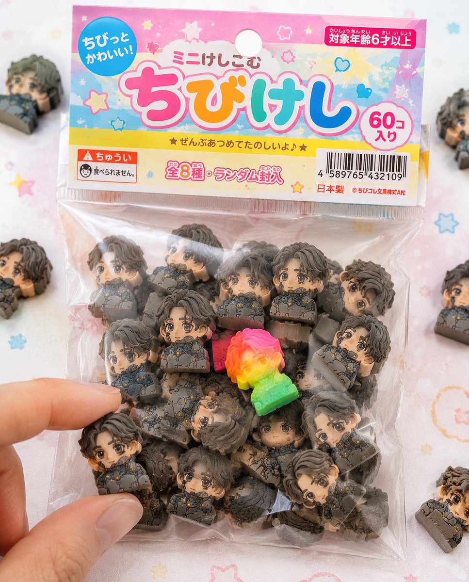
Full Prompt
Use the attached character sheet as a STRICT design reference. Do not change the face, hairstyle, eye shape, or proportions under any circumstances. ■ Purpose: To fully commercialize the character as a Japanese "{argument name="product name" default="chibi eraser product"}" and create realistic packaged product photos like those sold in stationery stores or gashapon machines. ■ Concept: "Bagged chibi eraser products sold in 100-yen shops and stationery stores." ■ Eraser Main Body: (Maintain exact same specs as before) - Strongly deformed chibi character - Thick block shape - Fully matte rubber material - Fine particles/powder/chips/wear present - Print misalignment/color variations - Random configuration of 50+ items. ■ Packaging (CRITICAL): - Small transparent plastic bag (OPP bag) - Paper header at the top (with hanging hole) - Slightly cheap printing on the header (slight misalignment/ink unevenness) - Wrinkled vinyl, slightly cloudy, sticking to contents due to static - Some air inside causing bulging - Light warping on the sealed section. ■ Graphic Design: - Japanese children's stationery style - Pop and colorful ({argument name="color theme" default="pink, yellow, light blue"} base) - Handwritten-style or rounded fonts - Product logo (original okay) - Text like 'Mini-Keshi' or 'Chibi-Keshi' - Stars, hearts, sparkle decorations. ■ Informational Elements (Enhanced Realism): - JAN code (barcode) - 'Ages 6 and up' - 'Not edible' warning - 'Total X types' or 'Randomly included' - Small company name (fictional) - MADE IN JAPAN or CHINA markings. ■ Composition: - Packaging is main in center of frame - A few spilled erasers around - 1 or 2 out of the bag - A fingertip picking one up for effect - Natural feel with some frame-out. ■ Rare Element: - Mix in one special individual with fluorescent color or gradient - Place in a prominent position to guide the viewer's gaze. ■ Lighting: - Bright natural light (slightly high-key) - Soft shadows - Cleanliness like a product catalog photo. ■ Camera: - Macro-leaning - Shallow depth of field - Sharp center. ■ Background: - White to pastel table - Subtle dots or pop patterns - Simple and clean. ■ Prohibited: - Plastic feel - glossy expression - Overly high-end texture (cheapness is correct) - Overly perfect printing. ■ Output: - A level indistinguishable from real products - Reality like items found in convenience stores or 100-yen shops - Quality that makes people on SNS say 'I want this.'