Case Media
Case Notes
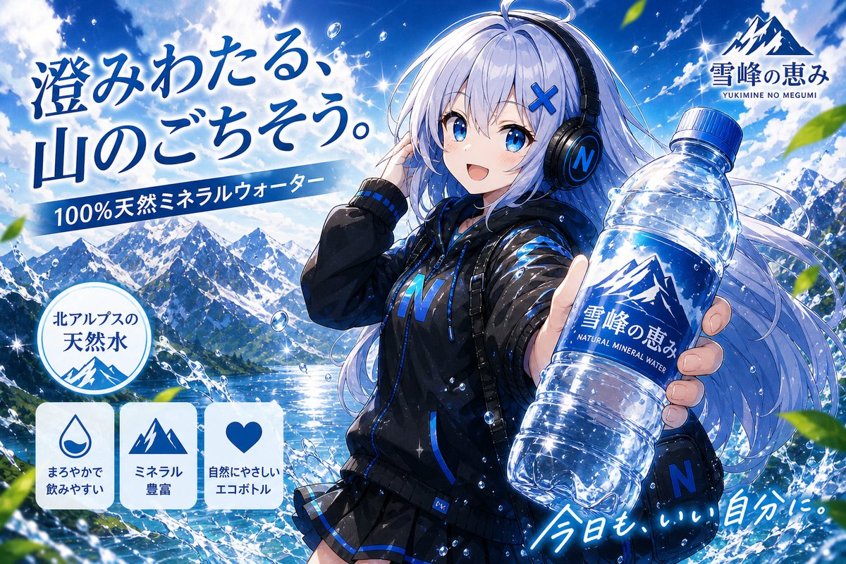
This page keeps the media, full prompt, and original source together so you can inspect the result first and decide whether the prompt is worth copying, saving, or comparing.
Case Insights
To make this page easier to search, cite, and reuse later, the case is also broken down into practical guidance about usage, visual cues, and prompt structure.
Best Fit Scenarios
- Use this as a character design benchmark when you need a fast style baseline before rewriting your own prompt.
- It is especially helpful if your target overlaps with Cinematic, Poster, Illustration and you want to judge the image result before tuning wording.
- Keep it as a control sample when you compare nearby prompt variants one variable at a time.
Visual Signals To Notice
- The clearest style signals here are Cinematic, Poster, Illustration, so those should usually stay in your first rewrite.
- Look at silhouette, costume language, mood styling, and whether the character reads clearly at a glance.
- This case keeps one primary output, so the first image should be treated as the main visual reference.
How The Prompt Is Structured
- The prompt reads as a long, highly specified prompt, which is useful when you want to judge how much specificity this direction needs.
- Its keyword cluster is centered on Cinematic, Poster, Illustration, so you can usually keep that cluster while swapping subject, camera, layout, or copy details.
- A practical rewrite path is: keep the outcome, keep the strongest style cues, then replace only the subject and environment blocks.
Good Follow-up Questions
- What changes first if you keep Cinematic, Poster, Illustration but switch the subject matter?
- Which part of the result comes from section-level structure (Character Design) versus tag-level style cues?
- Which related cases in the same section give you a cleaner or more extreme variation of the same direction?
Full Prompt
{"type":"high-energy anime commercial key visual for bottled natural mineral water","format":"16:9 widescreen advertisement poster, glossy cinematic illustration","brand":{"name":"{argument name=\"brand name\" default=\"雪峰の恵み\"}","romanized_subtitle":"YUKIMINE NO MEGUMI","logo":"sharp blue-and-white snow mountain emblem, placed in the upper right and repeated on the bottle label"},"main_subject":{"description":"young anime woman used as the commercial heroine, standing three-quarter view on the right side, long flowing silver-white hair with blue highlights, black over-ear headphones with a glowing blue N logo, blue X hair clip, black sporty water-resistant jacket with electric-blue accents and an N mark, pleated skirt hem visible, backpack straps, confident refreshing pose","face":"intentionally covered by a plain vertical pale gray rectangle, like an anonymized placeholder mask","action":"holding a clear plastic mineral water bottle toward the viewer in strong perspective with her right hand, left hand touching her headphones"},"product":{"count":1,"description":"large transparent crinkled PET bottle filled with sparkling clear water, blue cap, blue label, mountain logo, Japanese brand text, English text NATURAL MINERAL WATER, bright highlights and condensation"},"setting":{"environment":"dramatic North Alps mountain lake landscape with snow-covered peaks, deep blue sky, white clouds, glittering sunlight, splashing water arcs and floating droplets, green leaves flying in foreground","mood":"fresh, pure, cold, energetic, premium Japanese beverage commercial"},"layout":{"composition":"left side packed with advertising copy and feature badges, right side dominated by the anime heroine and oversized bottle, diagonal water splashes guide the eye from mountains to product","visible_text_sections_count":7,"sections":[{"title":"main headline","position":"upper left","count":1,"text":"{argument name=\"headline text\" default=\"澄みわたる、山のごちそう。\"}","style":"large expressive Japanese brush calligraphy in dark cobalt blue with white glow"},{"title":"blue ribbon claim","position":"left center under headline","count":1,"text":"100%天然ミネラルウォーター","style":"white sans-serif text on slanted blue banner"},{"title":"round origin badge","position":"lower left above feature cards","count":1,"text":"北アルプスの 天然水","style":"white circular seal with blue border, mountain icon at bottom"},{"title":"feature cards","position":"bottom left","count":3,"labels":["まろやかで飲みやすい","ミネラル豊富","自然にやさしいエコボトル"],"icons":["water droplet","mountain peaks","heart"],"style":"three rounded white cards with blue icons and blue Japanese text"},{"title":"brand logo lockup","position":"upper right","count":1,"text":"雪峰の恵み / YUKIMINE NO MEGUMI","style":"mountain icon above blue Japanese brand name and small roman letters"},{"title":"bottle label","position":"right center on product","count":1,"text":"雪峰の恵み / NATURAL MINERAL WATER","style":"blue label wrapped around bottle with white mountain logo"},{"title":"handwritten slogan","position":"lower right","count":1,"text":"{argument name=\"slogan text\" default=\"今日も、いい自分に。\"}","style":"white handwritten script with blue glow, angled upward"}]},"color_palette":"icy cobalt blue, bright white, transparent aqua, black clothing accents, fresh green leaves","lighting":"intense summer sunlight, lens flares, star-like sparkles on water and bottle, high contrast glossy anime rendering","style_keywords":"Japanese anime advertising art, beverage CM poster, ultra-detailed, dynamic perspective, crisp line art, vibrant saturation, clean commercial typography, sparkling water effects","customization":{"water origin":"{argument name=\"water origin\" default=\"North Alps\"}","hero accent color":"{argument name=\"hero accent color\" default=\"electric blue\"}"}}