Case Media
Case Notes
This page keeps the media, full prompt, and original source together so you can inspect the result first and decide whether the prompt is worth copying, saving, or comparing.
Case Insights
To make this page easier to search, cite, and reuse later, the case is also broken down into practical guidance about usage, visual cues, and prompt structure.
Best Fit Scenarios
- Use this as a character design benchmark when you need a fast style baseline before rewriting your own prompt.
- It is especially helpful if your target overlaps with Neon, Cinematic, Fashion and you want to judge the image result before tuning wording.
- Keep it as a control sample when you compare nearby prompt variants one variable at a time.
Visual Signals To Notice
- The clearest style signals here are Neon, Cinematic, Fashion, so those should usually stay in your first rewrite.
- Look at silhouette, costume language, mood styling, and whether the character reads clearly at a glance.
- This case keeps one primary output, so the first image should be treated as the main visual reference.
How The Prompt Is Structured
- The prompt reads as a long, highly specified prompt, which is useful when you want to judge how much specificity this direction needs.
- Its keyword cluster is centered on Neon, Cinematic, Fashion, so you can usually keep that cluster while swapping subject, camera, layout, or copy details.
- A practical rewrite path is: keep the outcome, keep the strongest style cues, then replace only the subject and environment blocks.
Good Follow-up Questions
- What changes first if you keep Neon, Cinematic, Fashion but switch the subject matter?
- Which part of the result comes from section-level structure (Character Design) versus tag-level style cues?
- Which related cases in the same section give you a cleaner or more extreme variation of the same direction?
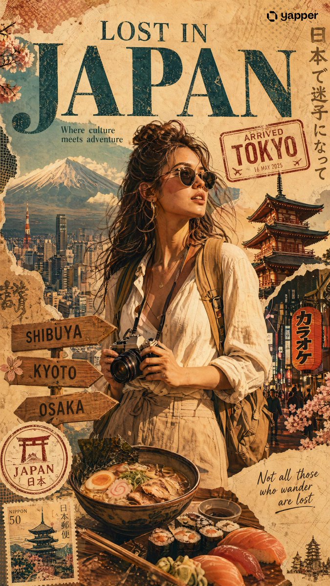
Full Prompt
Create a premium stylized travel poster / graphic collage for JAPAN. The main subject MUST be a stylish international female tourist (young woman, feminine face, long hair, slim body). She must clearly look female, not male or gender-neutral. Use a completely unique face identity. She is wearing modern travel fashion: linen shirt, neutral tones outfit, sunglasses, backpack, holding a camera. She looks confident and exploring. IMPORTANT: Use the SAME color theme and visual style as a cinematic Turkey travel poster: warm golden tones, teal accents, beige vintage paper textures, soft sunset lighting, slightly desaturated but rich colors. Keep the exact same mood, lighting, and color grading. Keep layout and composition consistent with a travel poster series: central character, layered collage background, balanced editorial design. Place her in a dynamic collage composition surrounded by Japanese elements: Mount Fuji, Tokyo city skyline, cherry blossoms, pagoda temple, neon street signs, ramen, sushi. Apply SAME collage style: torn paper edges, halftone dots, vintage textures, travel stamps, sticker elements. Include: "ARRIVED TOKYO" stamp direction board (Shibuya, Kyoto, Osaka) Japanese stamp style badge minimal decorative icons Add big headline: "LOST IN JAPAN" Add small text: "Where culture meets adventure" "Not all those who wander are lost" Lighting: cinematic warm glow, dramatic shadows (same as Turkey version) Style: editorial magazine collage, ultra detailed, 4K, print ready IMPORTANT: match the color grading, tones, and lighting exactly with the poster style